Technical Analysis
I remember when I first started investing and trading. I had no clue what I was doing. I would hear about a merger and rush into the stock only to watch it fall in coming months. Or I’d find a stock with a high dividend yield only to to see the stock price fall and collapse. I was buying whenever I thought the price was right and not thinking about what was the perceived sentiment of the company or what price would buyers step in to stop the falling knife, as they call it. Technical analysis changed all this as this study of charting price action is used by millions of investors/traders to evaluate when it is time to buy, sell, or hold a stock. I plan on making this post a primer to technical analysis; you may want to bookmark this post as it will be updated over time. My notes here are from a great course on Technical Analysis from Investopedia Academy.
Table of Contents
- Technical Analysis
- Charts
- Chart Analysis
- Understanding Technical Analysis
- Indicators
- Patterns
- Fibonacci Retracement
- Professional Technical Analysis
- Market Breadth
- Advanced Application
- Custom Indexes
- Technical Analysis & Trading
Technical Analysis
History of Technical Analysis
Technical analysis is the study of the market and its buyers/sellers. Markets can be related to any transaction such as stocks, futures, currencies, commodities etc…
Robert D. Edwards and John Magee wrote the bible of technical analysis like how Benjamin Graham and David Dodd wrote the book on value investing and securities analysis. However, we can go back further in time and see that Charles Dow, creator of Dow Jones Industrial Average, studied price action of a stock and noticed that stocks generally rise together and likewise fall together.
He created the first “ETF” and grouped companies that make the goods and companies that move/ship the goods.
Technical Analysis Vs Fundamental Analysis
- Fundamental
- earnings of companies
- direction of interest rates
- micro and macro economic developments
- competitors of companies
- and a lot more variables that effect underlying company
- looking for valuation of the company
- Technical
- assume all information and fundamentals have been priced into a stock
- analysis can be applied across all trading vehicles
- works on supply and demand principle
Charts
Arithmetic vs Logarithmic
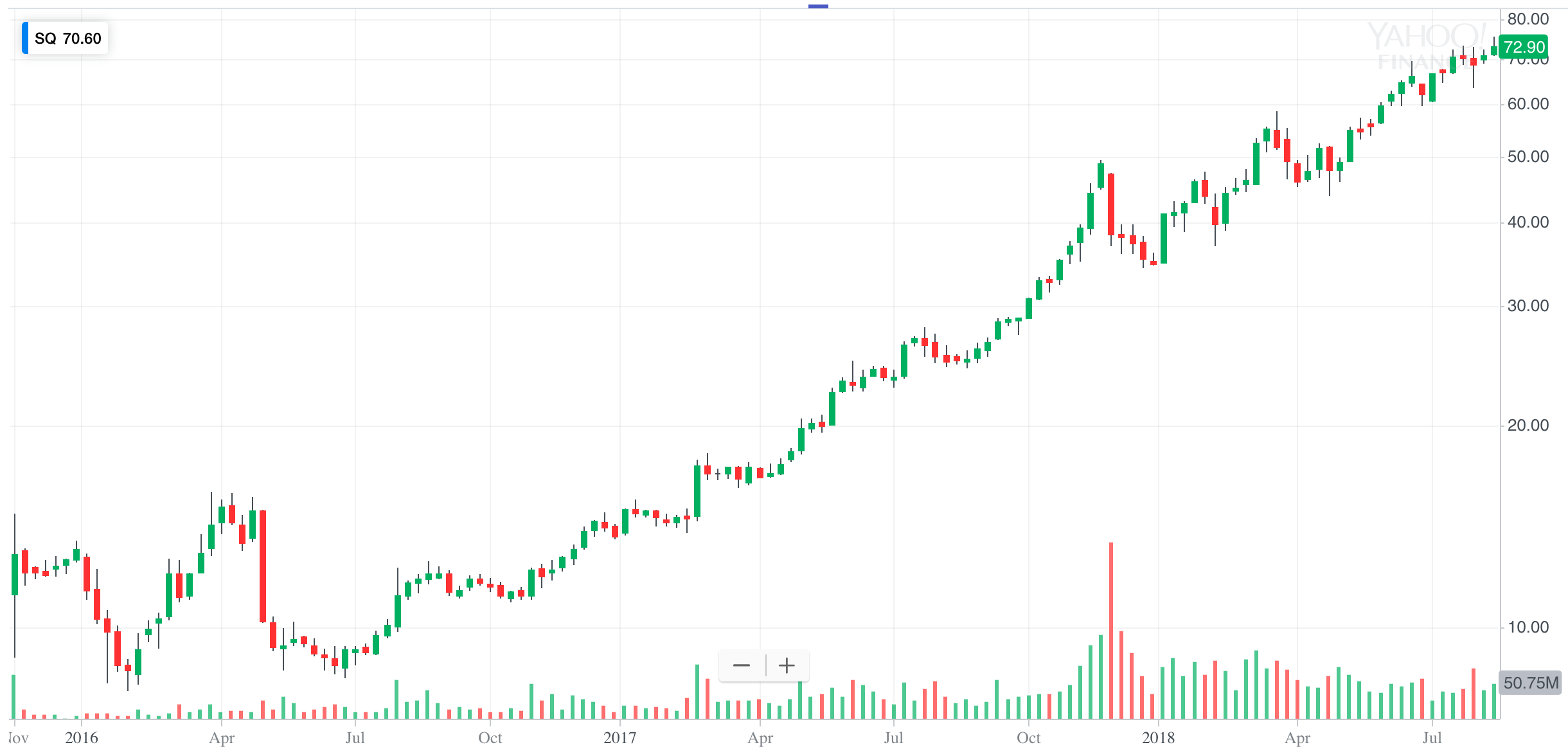
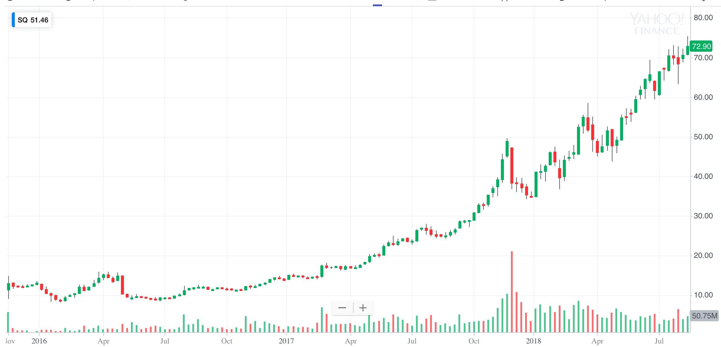
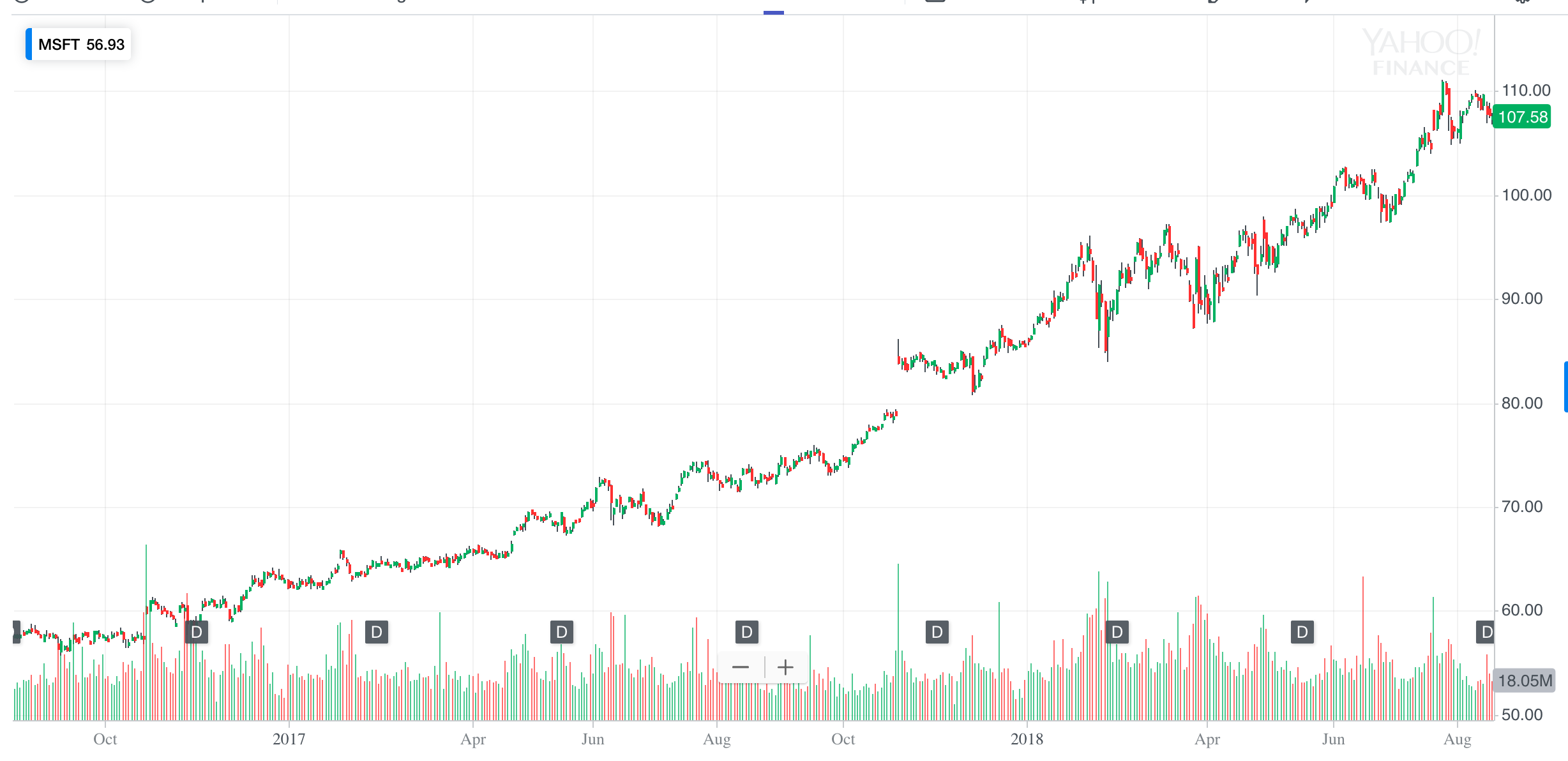
You will immediately see that logarithmic charts are not evenly spaced on the Y axis. The larger the space means the larger the percentage change in price. Arithmetic chart on the other hand has an evenly spaced out Y axis. Logarithmic charts show price volatility a lot more clearly vs an arithmetic chart.
Timeframes
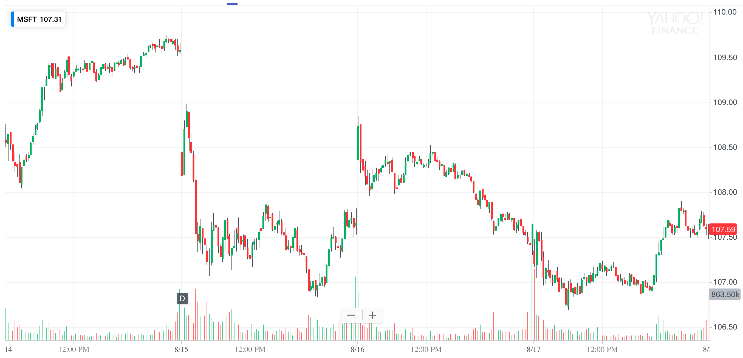
You can view price changes over different timeframes seconds, minutes, hours, days, weeks, months and years. Specific timeframes are well suited for different types of participants. It is best to go one timeframe higher to check for confirmation.
- Chart Timeframes
- Day Traders
- minutes plus daily
- Swing Traders
- daily plus weekly
- Investors
- monthly and yearly
- Day Traders
Clean Charts
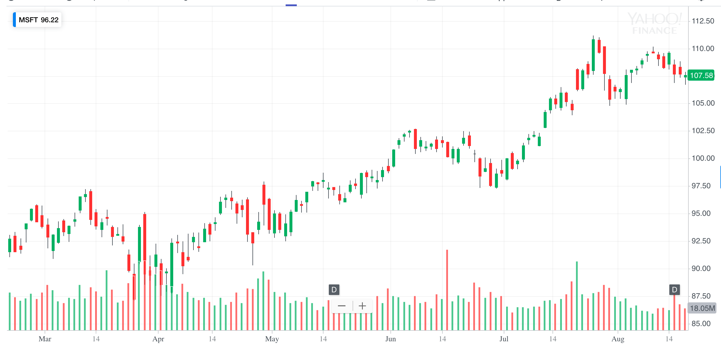
Keep charts clean and with minimal indicators. Over doing indicators and lines makes things difficult to read and evaluate price.
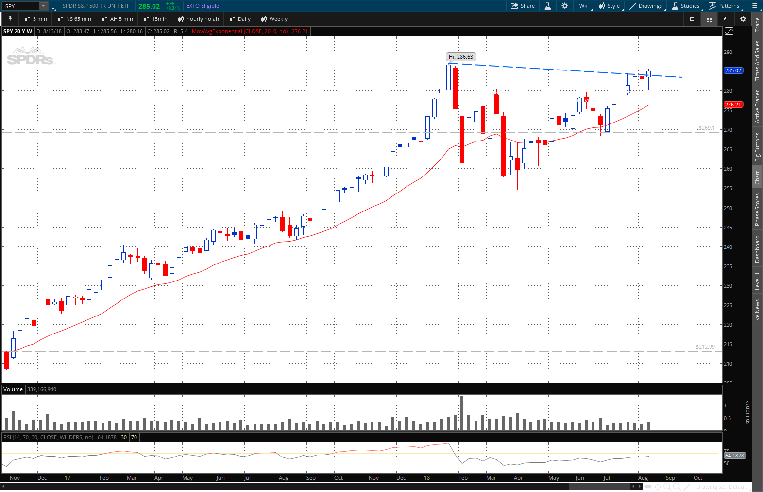
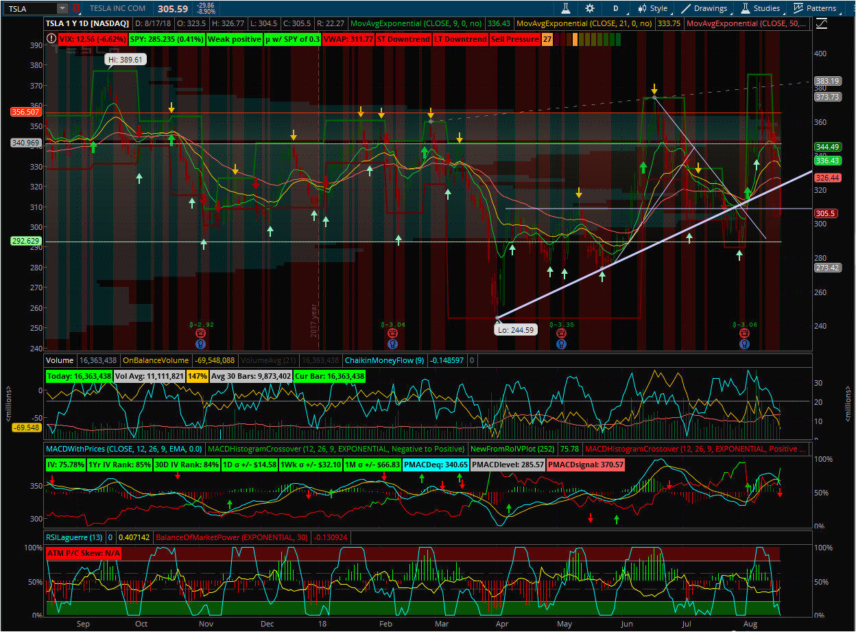
Chart Analysis
Bar Chart
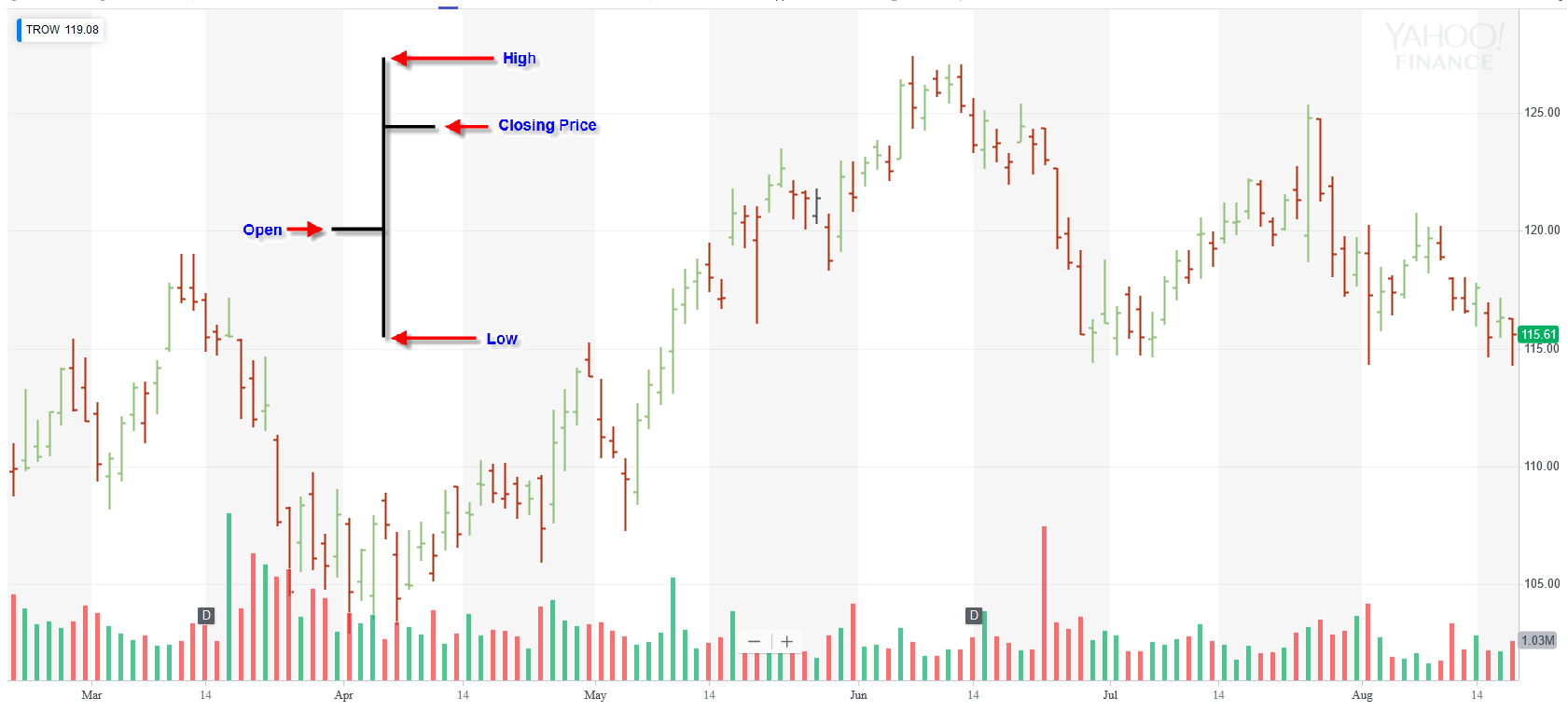
A bar chart is a composed of simple vertical line with a small horizontal line on the left and right of the bar. The bottom of the line shows the lowest price of that period and top shows the highest price of that period. The length of the bar is the difference between the highest and lowest price for that period. The left line shows the opening price for that period and the right line shows the closing price for that period.
Candlestick
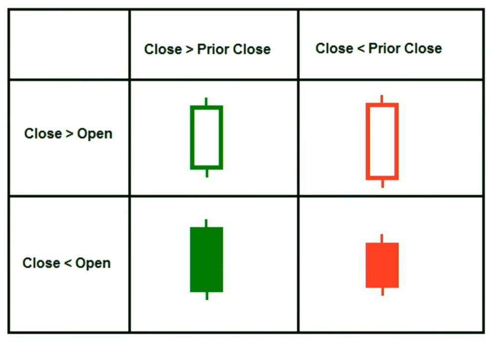
The most widely used chart is the Japanese candlestick chart. The concept was created by Munehisa Homma who was a rice trader in the 1700s. Its similar to the bar chart but tells a bigger story of how the period went. The candles can be filled(red/bearish) and hollow(green/bullish). The wicks tell us more about the price action for the period such that if the top wick is long it shows that there were more sellers. Likewise, if the shadow was long on the bottom and short on top it means there were more buyers.
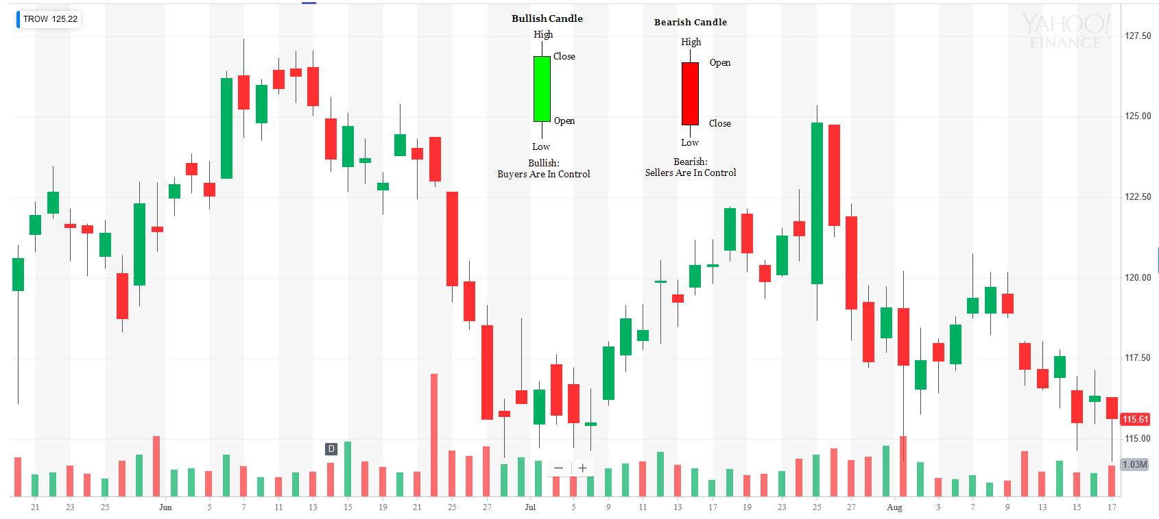
This chart type is very important for short term traders, in my opinion, as when you start putting together many candlesticks together you can gain some insight as to what pattern(s) are forming.
Candlesticks Doji
Sometimes you will see candlestick with no real body and those are called dojis. Dojis mean that the market was indecisive that day and the opening and close are virtually identical.
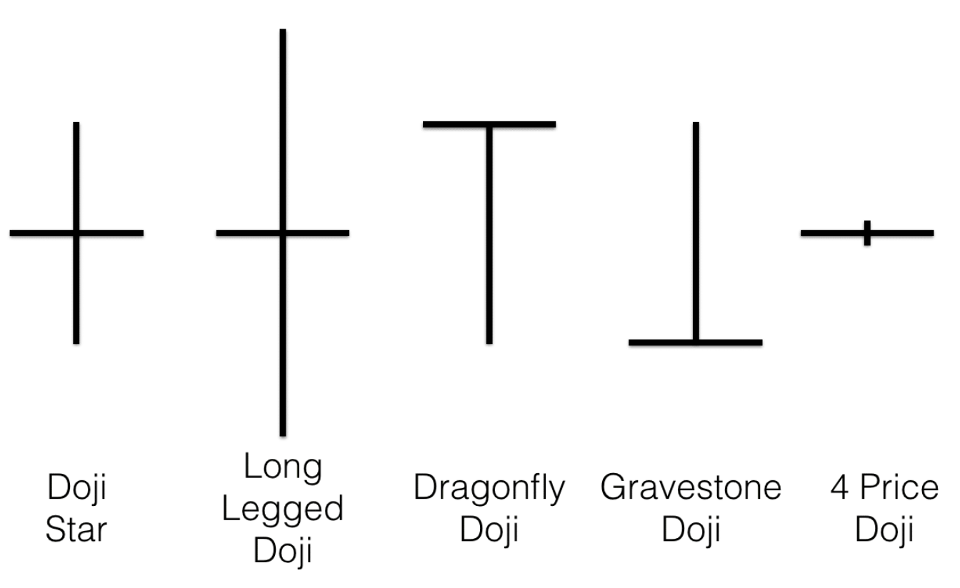
The two types of important dojis are the dragonfly and gravestone doji. The dragonfly doji has long bottom wick and closes at the top. When you see this in a downtrend it most likely means trend is starting to shift to bullish. Likewise the gravestone doji shows that buyers were getting exhausted during the period. If you see this in an uptrend it could most likely be trend is shifting to bearish.
Line Chart
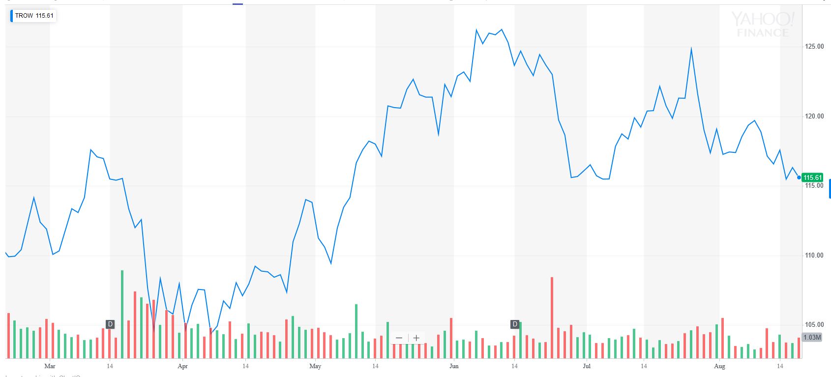
The line chart plots the closing price point of each period. When you plot several of these points together and connect the dots a directional pattern will emerge in which you can visually see the trend. The closing price is most important point on any chart as it is the agreed upon price by market participants for that period.
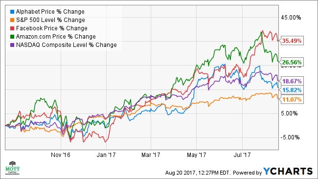
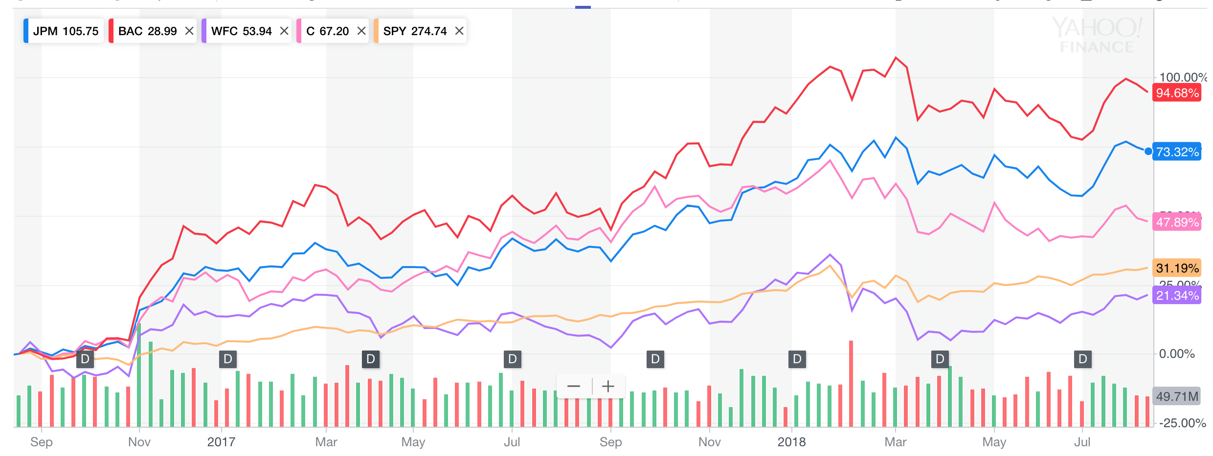
The best use case for line charts is when you compare two assets classes to see the performance between the two.
Moving Averages
Next to candlestick charts I believe that the moving average is the second most important tool for any technical analyst and trader. It is a smoothing mechanism for price changes. The three types of moving averages are simple, exponential, and geometric.
- Simple
- arithmetic moving avearge calculated by adding recent closing prices and then dividing that by X number of periods (ex: 20, 50, 200 days).
- Exponential
- same as simple moving average but it is a weighted moving average that gives more importance to recent price data.
- Geometric
- takes into account the compounding that occurs from period to period.
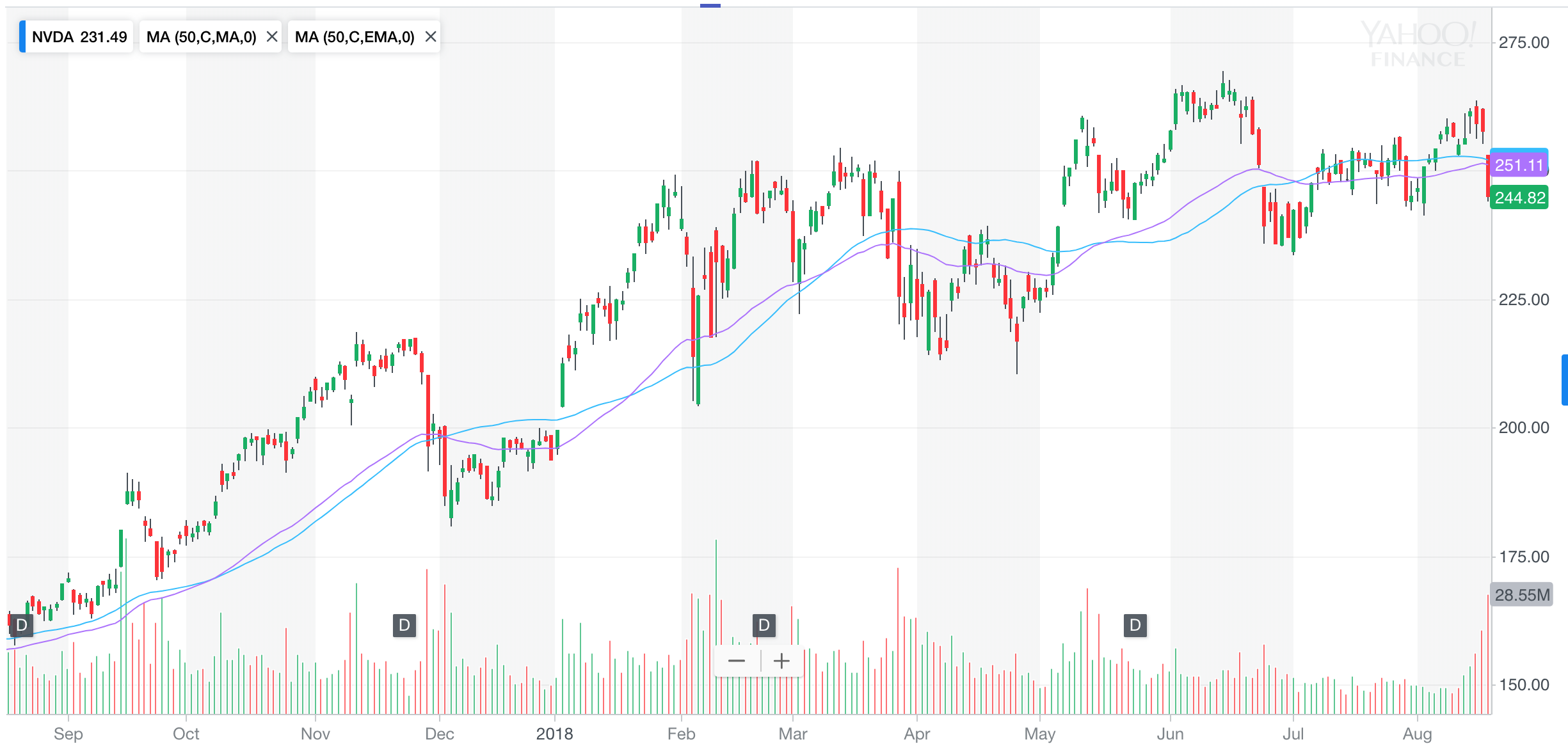
Moving average IS NOT a support or resistance area but its a supplement to help view the direction of the trend. If the moving average is flat it means that the stock is moving sideways and will be choppy; STAY AWAY. When a stock falls near or under a moving average but the direction of the long term trend is still up those would be perfect time to buy.
Trend Lines
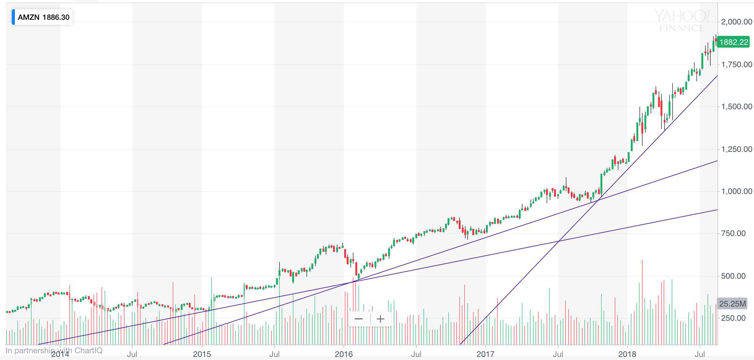
Our entire goal as technicians is to identify trends in stocks. We want to be buying stocks in uptrends and sell stocks in downtrends. Minimum points of contact needed to draw a trend line is 2. When market returns to that contact point it should signal buyer/sellers to come in.
Trend Lines Horizons
You can connect many new trend lines depending on the time horizon. You start creating fan lines as they are called to spot the short term trends within the longer term trends. See previous section image to see Amazon’s trendlines.
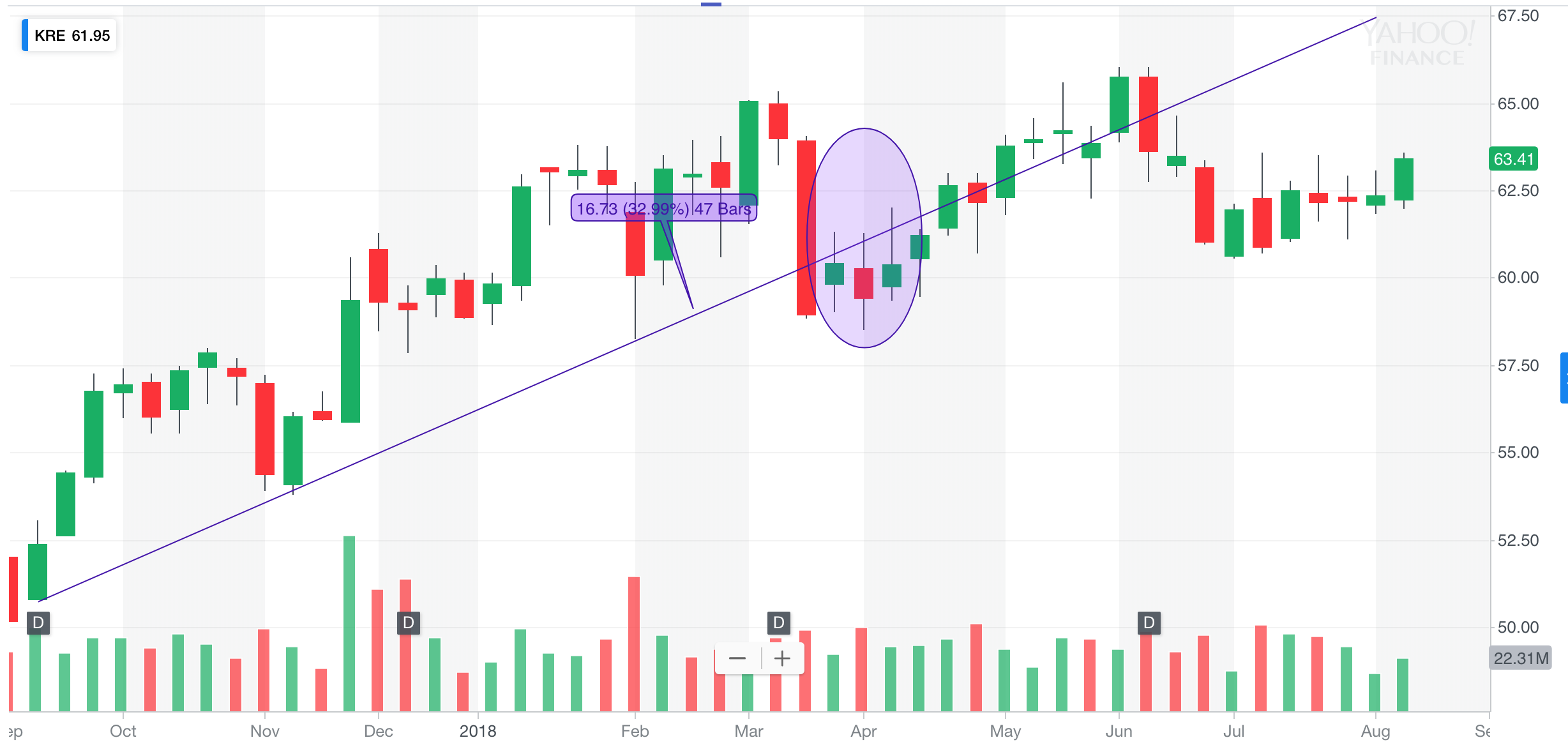
Trend Lines Kickback
The kickback is when price breaks through the trendline and then comes back up to try and retest the line but usually gets rejected and fails. That is basically last opportunity to sell before it falls and a new trend forms.
Trend Identification
Three main questions to ask when identifying a trend:
- In which direction is the trend of the other stocks in this sector? (Sector ETFS)
- In which direction is the trend for other stocks in this country? (US, China, Emerging Markets)
- In which direction are the major stock indexes heading? (S&P500 & DOW)
Understanding Technical Analysis
Support And Resistance
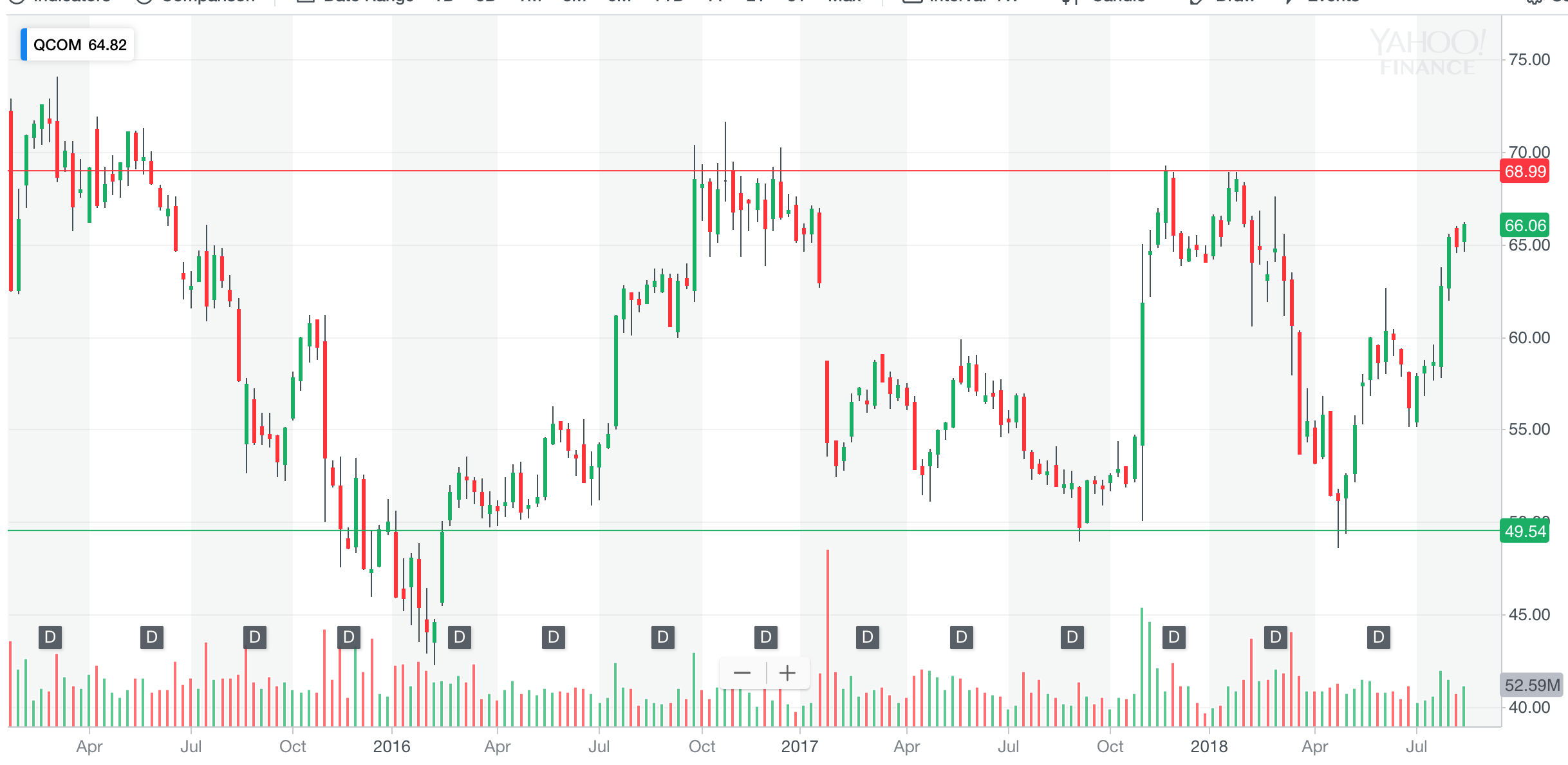
Support is just another name for buying at a certain price area. If price should happen to fall there once again buyers should come in and prevent the price from falling. The more a price area is tested and holds the stronger that level should be in the future should price fall.
Resistance is just another name for selling at a certain price area. If price rises to that area once again sellers will come in and prevent stock from rising. The more an area is tested the more significance it becomes.
Polarity 101
The main key point here is that support & resistance is where price gets rejected quickly. If price is constantly hugging against support or resistance its most likely going to break so watch out. The more times a level is tested the more likely it is to break. The reason is simply that the buyers and sellers at that level are gone.
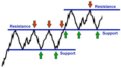
Once price breaks resistance that level becomes support and if price breaks support that area now becomes resistance. Very similar to kickbacks in trendlines. The buyers move up in willingness to pay for asset and sellers move to a higher level. Reverse is same for when support is broken.
Polarity Psychology
They reasoning behind support and resistance polarity is that buyers and sellers have shifted their price at which they are willing to buy or sell.
Resistance becomes support theory - Lets say a stock keeps getting sold off at $20. Once the stock breaks and there are no sellers left buyers drive up the price up to $30 and then stock sells off once high enough. The people who missed their opportunity the first time now buy at the previous resistance level creating support. Also people who shorted at resistance level cover their short.
Support becomes resistance - Lets say a stock keeps getting bought at $20 but one day people buy and the sellers drive price down to $10. On the next leg up the people who bought at support will sell to break even and shorts will start shorting in anticipation of this.
Polarity Volume By Price
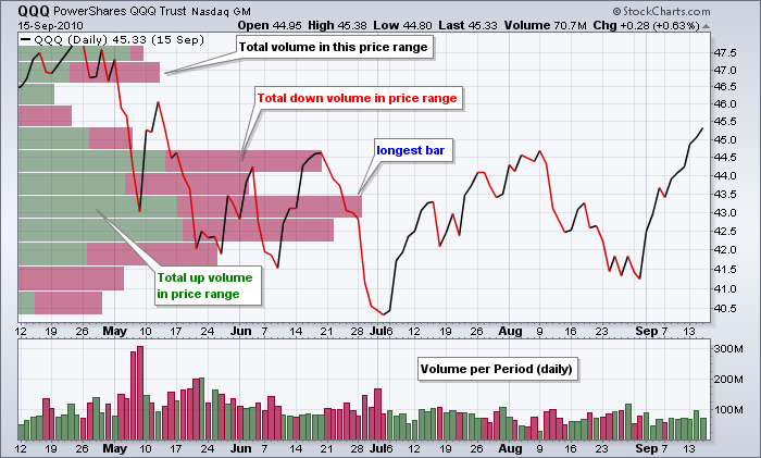
Usually volume is plotted underneath a period but volume by price plots the volume vertically matching it with price. It is perfect tool to find the levels of which support and resistance exist. It is not necessary to have volume by price indicator as you will see several areas on the chart at which price fluctuates.
DJIA And DJTA
Dow recognized that markets moved together. When indexes are making new highs then the stocks of companies associated with the index should also be making new highs. So taking oldest two indexes the transports and industrials since they are both linked via the economy if the industrials make a new high the transports should also make new highs; confirming the move.
If you see a divergence where the industrials are making new highs but the transports fall then something is changing and it is a signal that the market is shifting. “So goes the DOW so goes the market”.
Market Trends
You must recognize the direction of the primary trend.
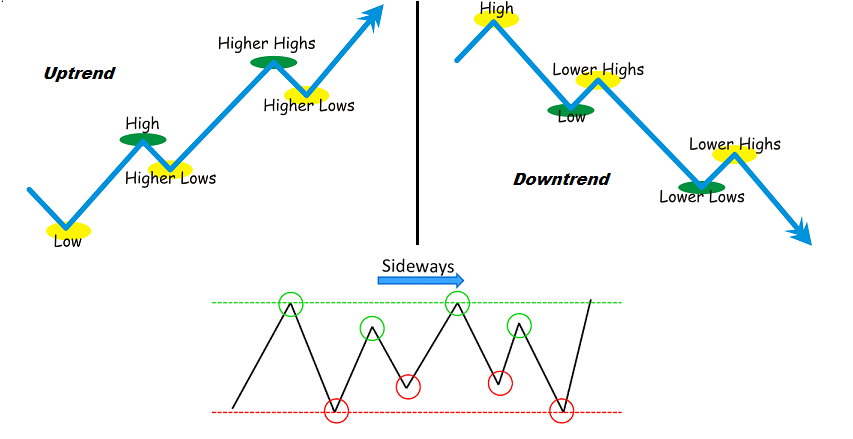
Averages Discount Everything
Technical analysis follows the rule that every information known earnings, lawsuits, new product cycles, competition etc… is already priced into the stock. Just think about how fast a stock moves now when news hits the public.
Closing Prices
The closing price is the most important price during the period. This is a collective agreement between buyers/sellers of a price at the end of the period.
Bull Markets
First phase is accumulation phase where institutions buy out of favor stocks and build up a position. The second phase is the rally or breakout phase where everyone is buying and the prices are driven up. Good or bad news stocks still keep rallying. The third phase is the top or distribution phase where people who have accumulated in the beginning start selling off their positions. Everything is rosy and media is very optomistic.
Bear Markets
The first phase is the distribution phase where the news is all good but people are selling as prices have become very inflated. Rallies start to fade and gains cannot be held. The second phase is the sell-off where people start selling into earnings or even on good news. Media will create specials like “market meltdowns” and will use words like “profit taking” etc… The last phase is the puke phase where people finally realize and start selling and momentum picks up. Over time the prices become cheap and institutions start to accumulate which leads to another bull market.
Indicators
Relative Strength Index
The relative strength index has a standard of 14 periods and is a momentum indicator. It is not related to relative strength which is used to compare assets performance. The RSI oscillator goes from 0-100 where 30 = oversold and 70 = overbought.
Overbought & Oversold
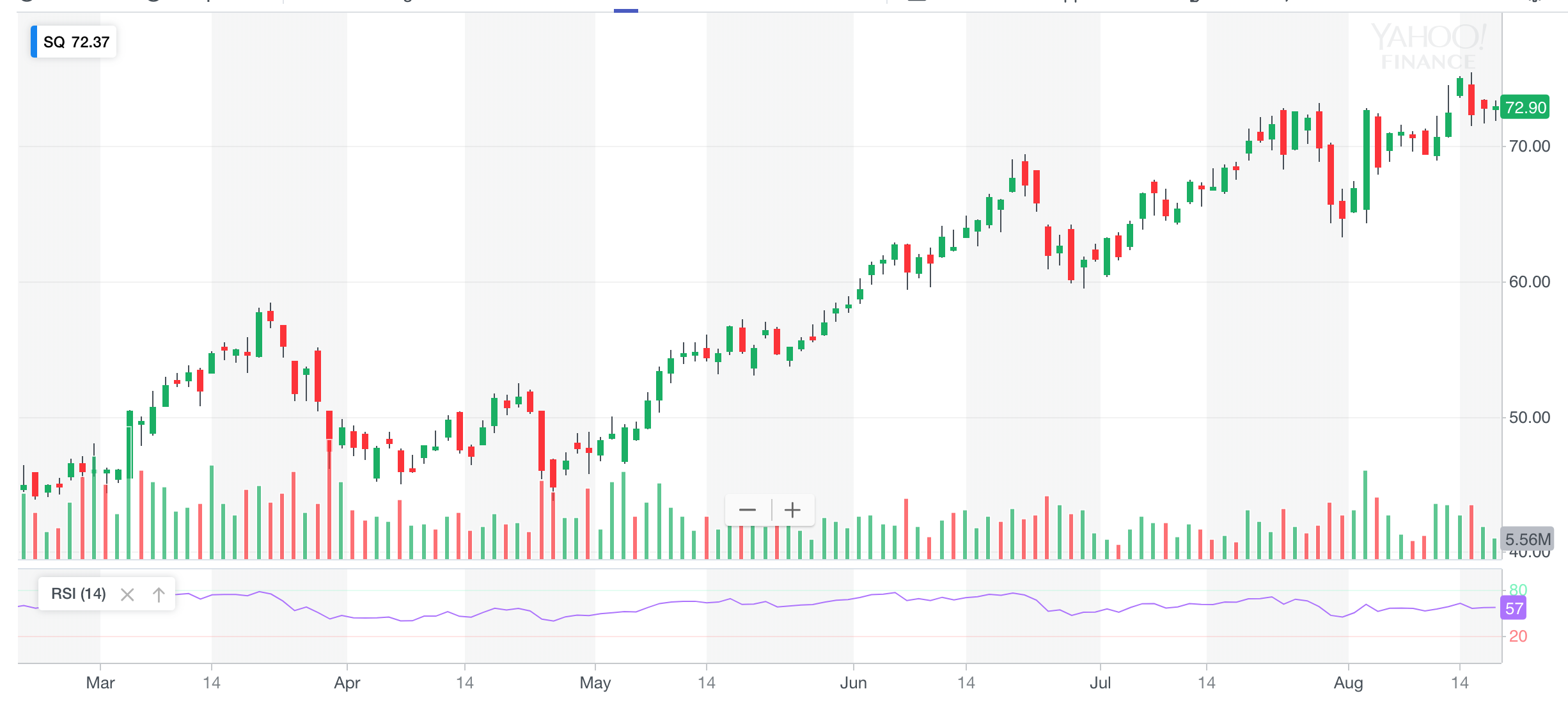
We can observe the range that RSI is in to see the momentum. In an uptrend the RSI will get above 70 in the rallies and when it gets sold off for corrections the RSI will typically stay above 30s may even stay above 50. The stock will not get oversold but will get overbought. If momentum falls and stays below 30s then something has changed
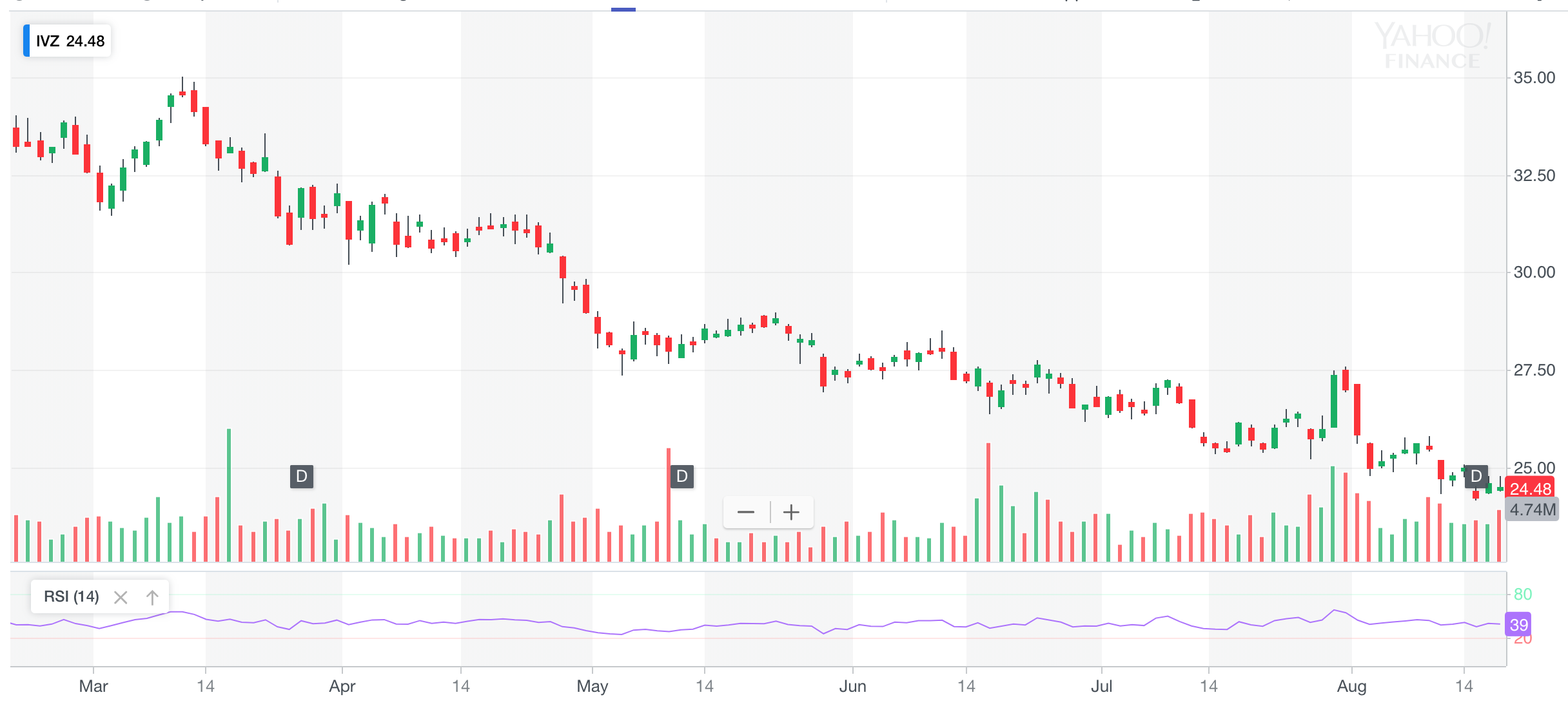
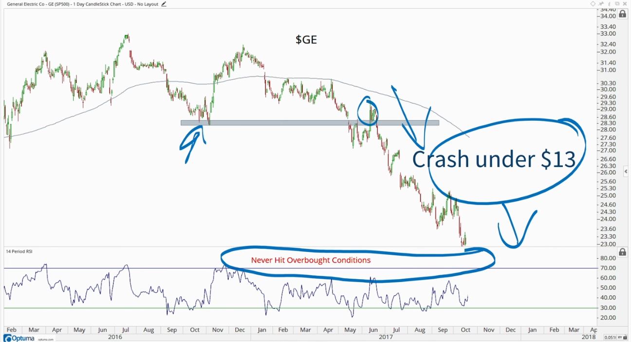
In a downtrend each rally gets sold off and RSI barley if ever gets above 50-60s. The downtrend will usually stay near the 30s. The stock will not get overbought but will get oversold.
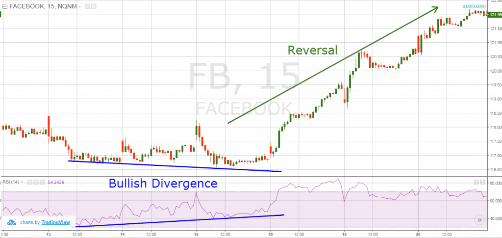
Momentum Divergence Bull
RSI can be used to find out divergences and confirmation of the trends. If prices make a lower low but the RSI makes a higher low that is a signal for bullish divergence. It means that the trend is changing doesn’t mean trend is reversing.
Momentum Divergence Bear
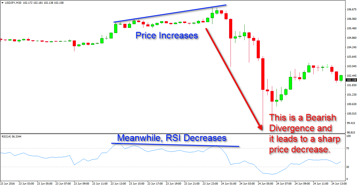
RSI can be used to find out if a bearish divergence is among us. If the price make a higher high but the RSI level make a lower high that is a signal for bearish divergence. It means that the trend is changing doesn’t mean trend is reversing.
Relative Strength
Buy side institutional fund managers look for two things: momentum and relative strength. Relative strength compares 2 or more asset classes with each other and you identify which one is outperforming. The one outperforming is the one you want to be in.
Patterns
Continuation Patterns
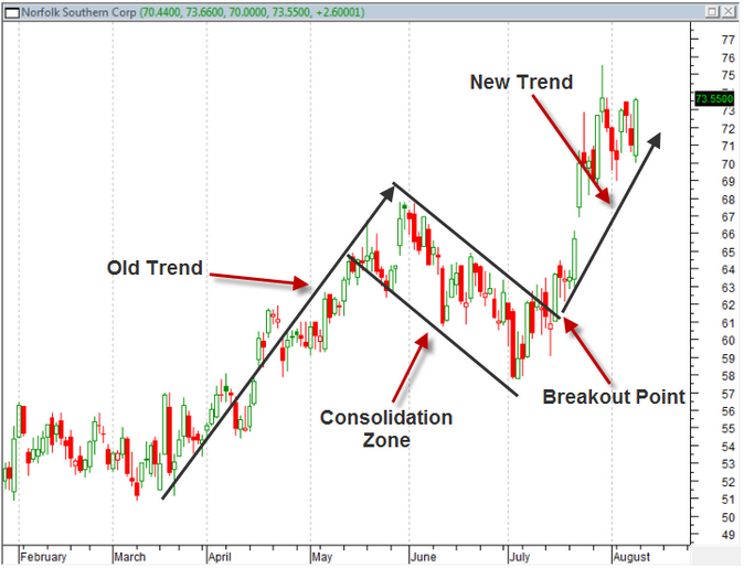
There are two types of patterns in technical analysis, continuation and reversal patterns. Patterns can take either few weeks to develop or even months to years.
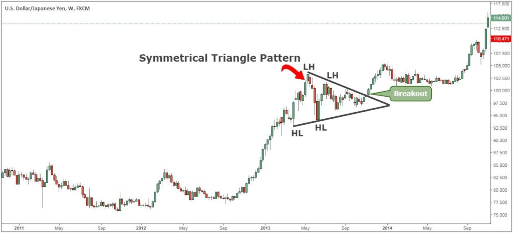
- Symmetrical Triangle
- Uptrend followed by consolidation in time where market is digesting the gains
- There is a converging trend line where the downtrend meets uptrend
- About 2/3 to 3/4 from the apex
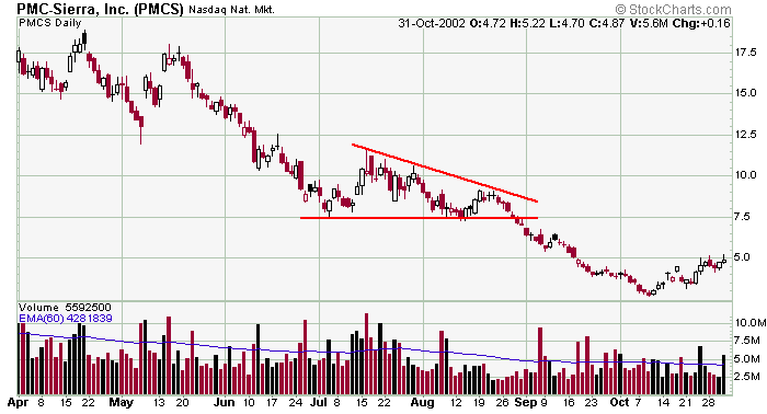
- Descending Triangle
- A downtrend line which is the upward boundary line
- A horizontal line forming a lower boundary as the floor
- Upward boundary converges to the lower boundary
- Ascending Triangle
- Seen a lot in up trending markets on strong stocks
- Upward boundary is horizontal forming resistance
- Lower boundary is converging up to upward boundary
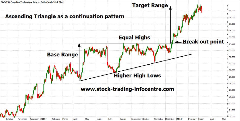
If the pattern forms during a downtrend expect continuation to the downside.
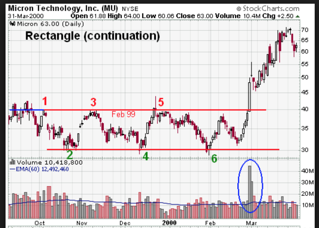
- Rectangle Pattern
- Top and Lower boundaries are both horizontal
- Consolidates in a support and resistance zone.
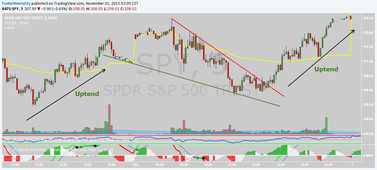
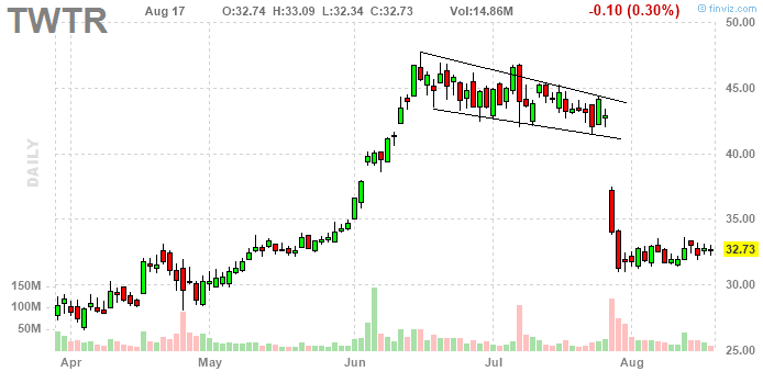
- Falling Wedges
- both upward and lower boundaries are declining
- Rising Wedge
- both upward and lower boundaries are ascending

- Pennant
- Previous sharp move up or down
- forms a mini asymmetrical triangle
- very short period
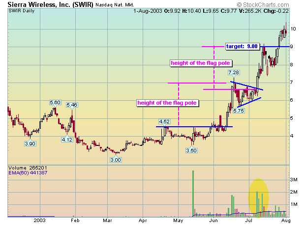
- Flag
- Like the pennant pattern
- Top and lower boundaries decline perpendicularly
Head and Shoulders
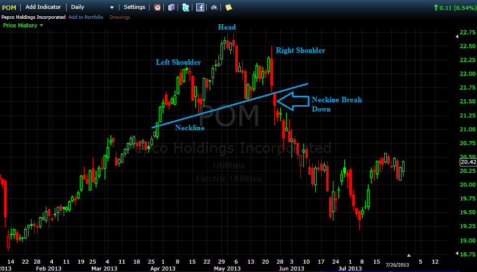
For the Head and Shoulders pattern you first need an underlying uptrend and a new high in price which is followed by a drop in price; this is phase 1. The second phase is the uptrend resumes and reaches a new high where it then falls back down to where the previous drop was before the new high. The final phase is that it rallies once more but fails to reach the new high and falls back down to previous support level also called the neckline where it fails and breaks downward.
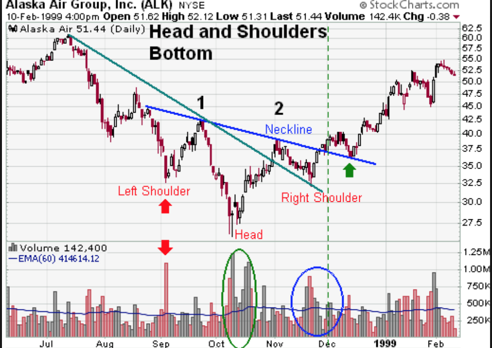
We can flip this and also have a head and shoulders bottom reversal pattern. Where the trend goes from bearish to bullish. Remember the key is that it needs to break the neckline. If it doesn’t then then pattern continues to what it was prior.
Microphone
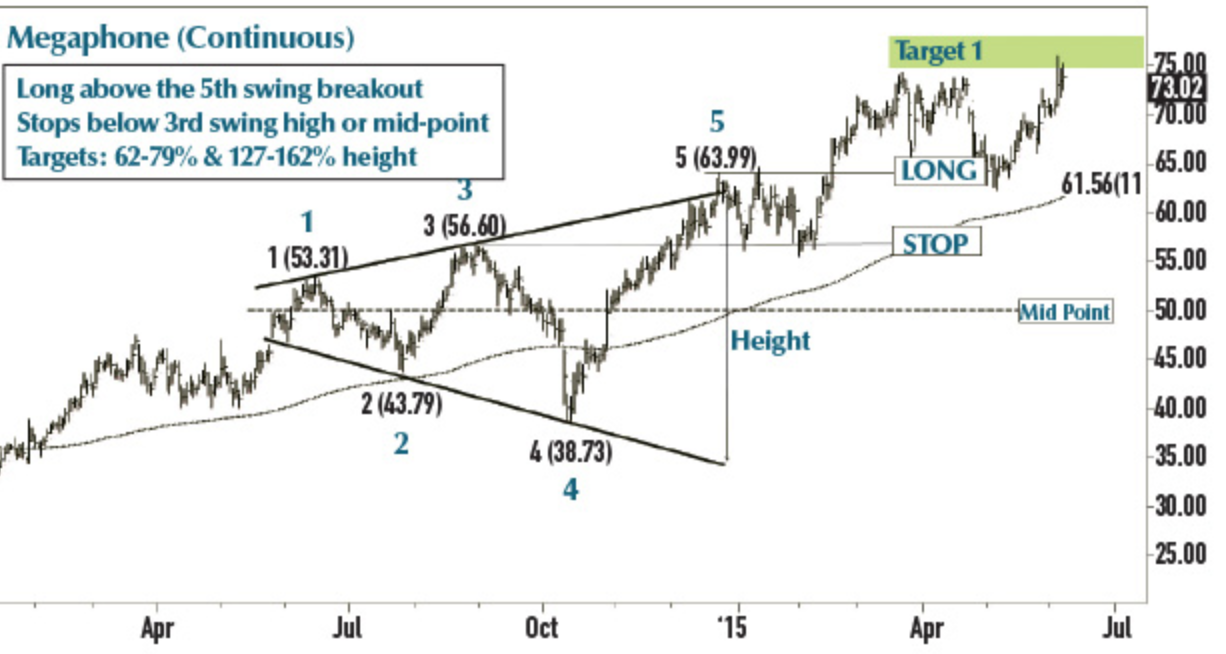
In the rare microphone pattern the top and bottom boundaries expand away from one another broadening. This means that volatility is starting to pick up. Be careful with this pattern as it fluctuates up and down very quickly.
Rounding Top & Bottom
The rounding bottom pattern starts with a decline in prices. The next phase is a long timeframe where bulls and bears battle at prices consolidating and forming a saucer type base. No one is making money in these periods. The phrase “longer the base higher in space” means that the longer the time a base is forming the higher move to the upside could take place.
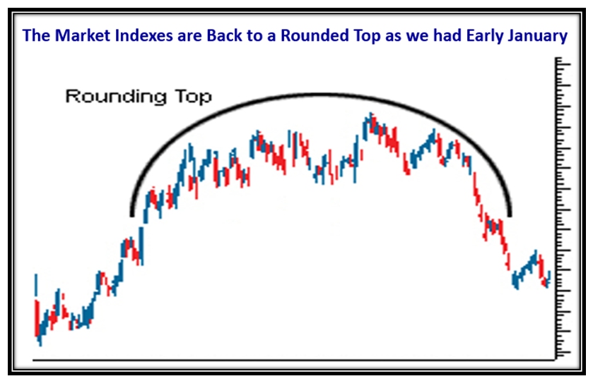
The rounding bottom is the same as rounding top but flipped in that it starts in and uptrend, forms the base, and eventually crashes downward.
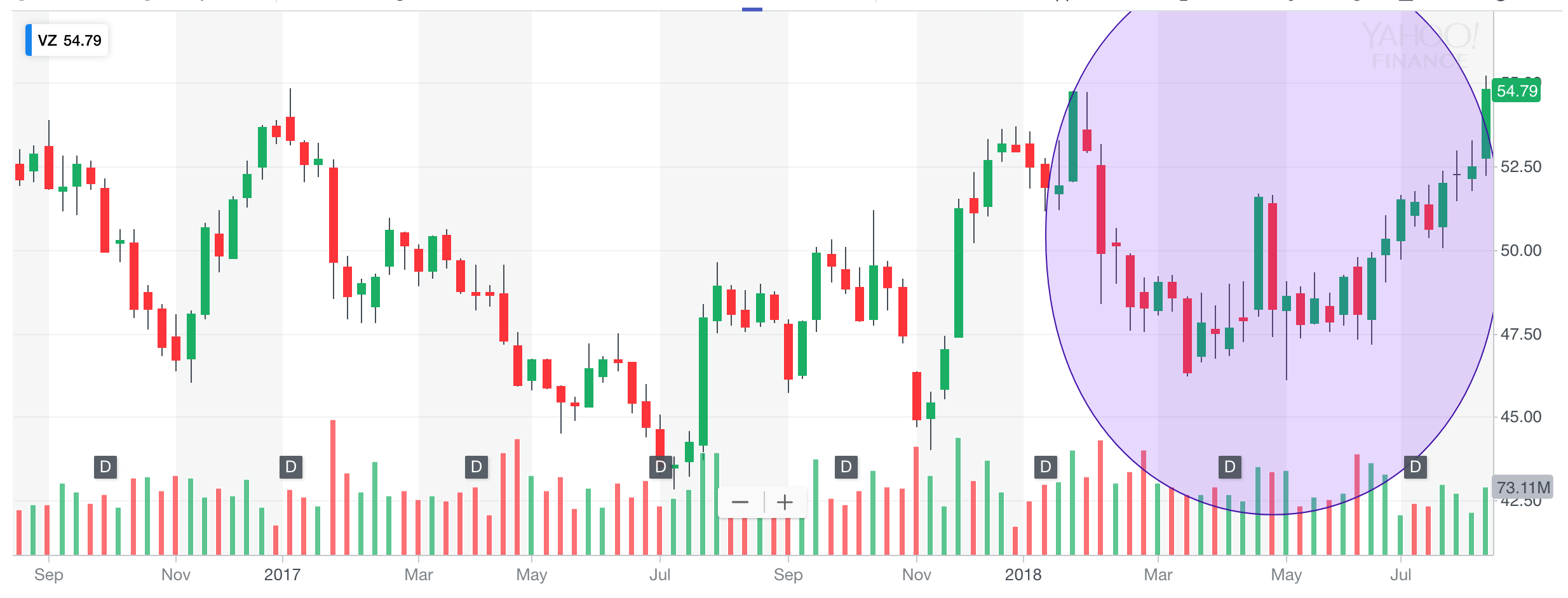
Double Top & Bottom
The double bottom is quick pattern where price comes from a downtrend and slingshots from a price upward and then comes back down to retest the low and holds/slingshots up again. The strongest conviction of a double bottom is when on the second retest the price slightly dips below the first one.
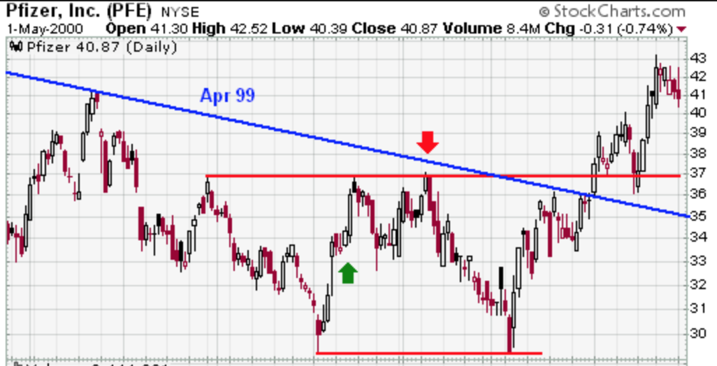
Double tops are the same but just reversed. Remember we would want the second top to be slightly above the first one for a strong confirmation.
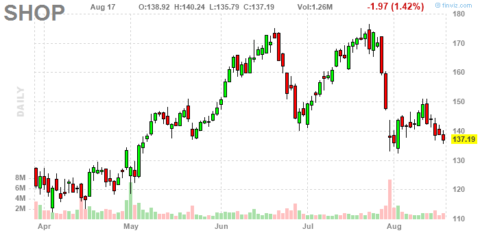
For a stronger conviction look for RSI to make a higher low.
Failed Patterns
Not all continuation patterns continue the trends. If the trend breaks and does not continue something must have fundamentally and sentiment has changed. It is best to get out of the trade but sometimes there are false positives so make sure to get confirmation with a kickback.
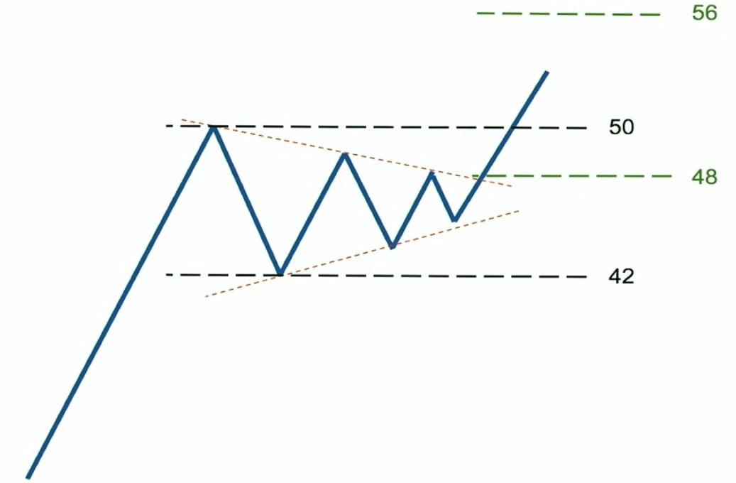
Price Target
To find the measured moved price target after a breakout from the continuation pattern identify these:
- Identify the amplitude, or the difference between the high and low points, of the Pattern.
- Identify the point in which the stock breaks the pattern, or the breakout.
- Set the price target by adding the amplitude to the breakout (or subtracting, if going short).
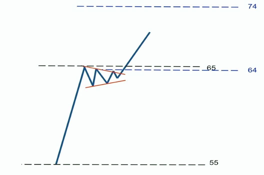
Pennants and flags are a little bit different since they are short term patterns and will need to identify these:
- Identify the difference between the start and end of the previous rally (the ‘Flag Pole’) moving into the pattern.
- Identify the point in which the stock breaks the pattern, or the breakout.
- Set the price target by adding the flag pole to the breakout (or subtracting, if going short).
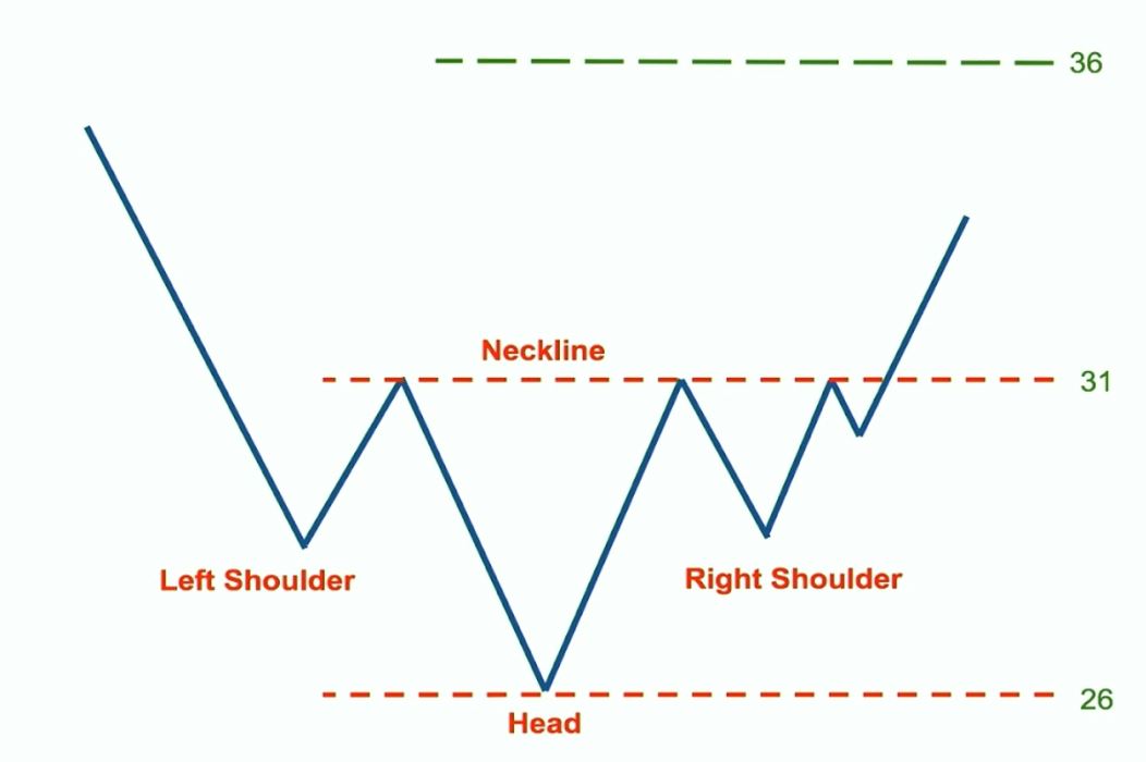
For something like a head an shoulders pattern identify these:
- Identify the amplitude, which in the case of head and shoulders patterns, would be the difference between the head and neckline.
- Identify the point in which the stock breaks the pattern. For H&S, the breakout is the same as the neckline.
- For H&S tops, set the price target by subtracting the amplitude to the neckline. For H&S bottoms, add the amplitude to the neckline.
Fibonacci Retracement
Fibonacci Problem
The fibonacci tools is arguably one of the most value tools for a technical analyst. You either abide by it or don’t use it at all. The fibonacci retracements were created by Leonardo Fibonacci on some question about how many rabbits can be produced from a pair of rabbits enclosed in an area. The process of how the solution came about was the fibonacci numbers that supposedly keep reoccurring throughout nature. The number pairs 1, 1, 2, 3, 5, 8, 13, 21, 34... keep going on forever.
Fibonacci Sequence 0.618
In the fibonacci sequence when you add any two numbers together you will arrive at the next number in the fibonacci sequence. If you divide any sequential pair with each other the solution will always be 0.618.
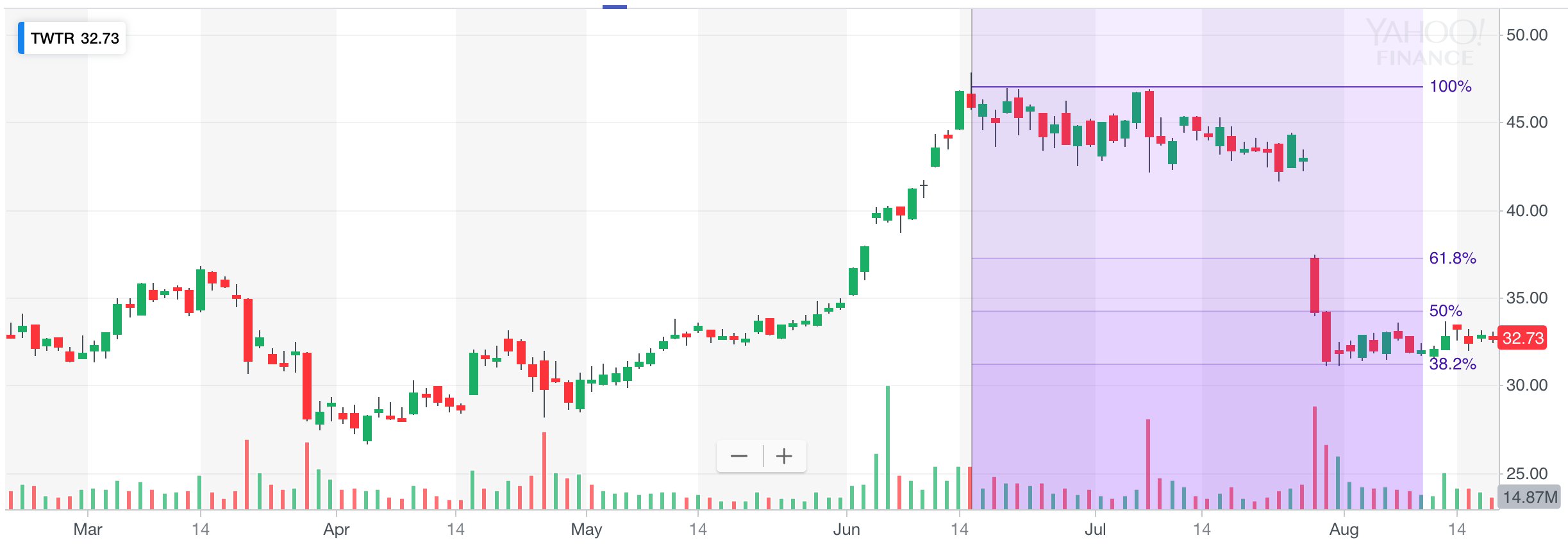
When markets are trending they correct to both the down and upside. You can use the fibonacci sequence to predict retracement price targets. Market usually will respect those levels. So for instance if a downtrending stock climbs back up it will retrace 61.8% of the price lost from the downtrend.
Fibonacci Sequence 1.618 (Golden Ratio)
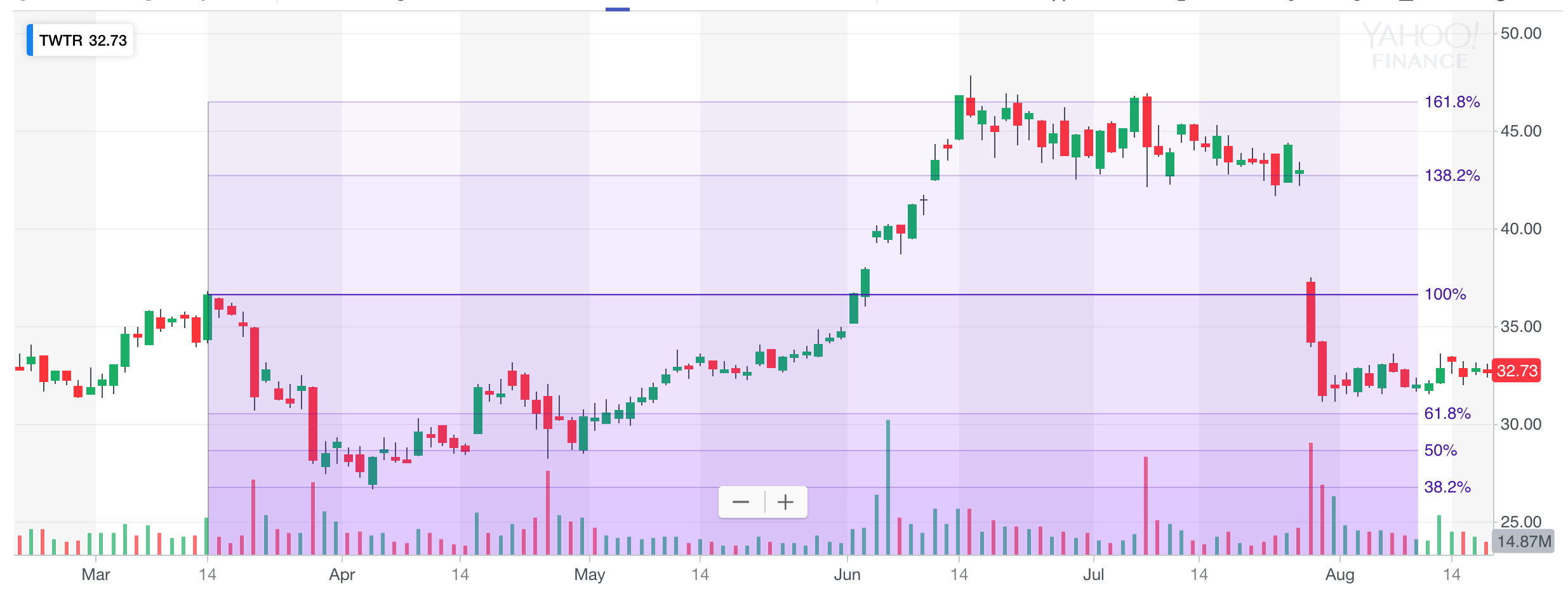
When you divide the larger number to the number on its left you will always get 1.618. When you have a breakout take the prior high to the prior low and above that you will see 161.8% range that will be your price target. See twitter after it stalled from an initial rally in March and to the low in April it eventually broke out and went high as 161.8% from the low in April.
Fibonacci Sequence 2.618
Going further dividing larger number to the number 2nd to the left of it (ex: 13/5) you will end up closer 2.618 or 261.8%.
Fibonacci Sequence 4.236
Going even further dividing larger number to the number 3rd to the left of it (ex: 13/3) you will end up closer to 4.236 or 423.6%.
Fibonacci Sequence 6.854
Lets go one more time further dividing the larger number to the number 4th to the left of it and you will end up closer to 6.854 or 685.4%. Years in an uptrend the market will still respect the fibonacci levels.
Professional Technical Analysis
Top Down Approach
The top down approach to the market consists of a series of analysis starting with the broader macro economy and then working your way down to a specific company(s).
Top Down Method
- International macro indexes all over the world
- see what is best performing and or what is about to be breaking out
- Indexes in the country where we are focused
- look into top performing indexes
- Work our way down to sector level
- find the leading sectors
- Identify the individual stocks within the leading sectors & industry groups
- buy leading group stocks
- sell laggard group stocks
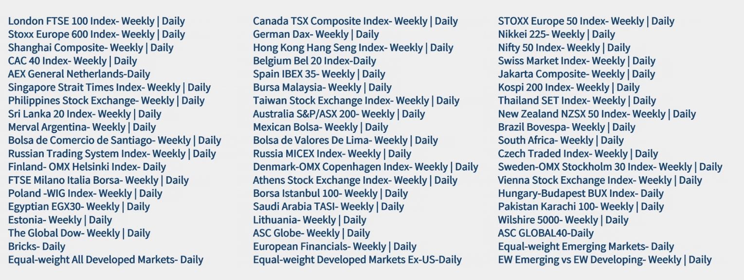
When performing your analysis start with a weekly or yearly timeframe and then take it one step down to looking at the daily timeframe. The shorter the timeframe the shorter the trade timeframe.


Before heading into trade one should also do some intermarket analysis between other asset classes such as currencies and commodities.


Last step would be to look at leading stocks in the sector and picking the best performing one.
Intermarket Analysis
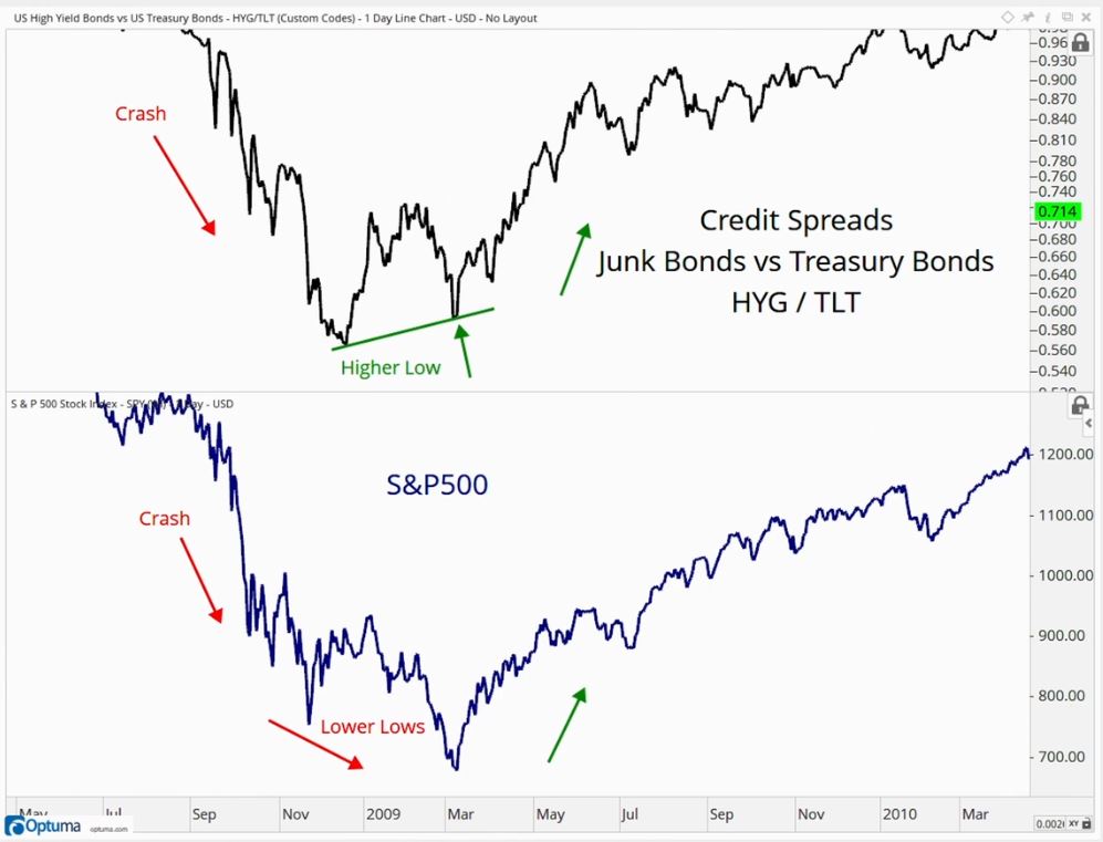
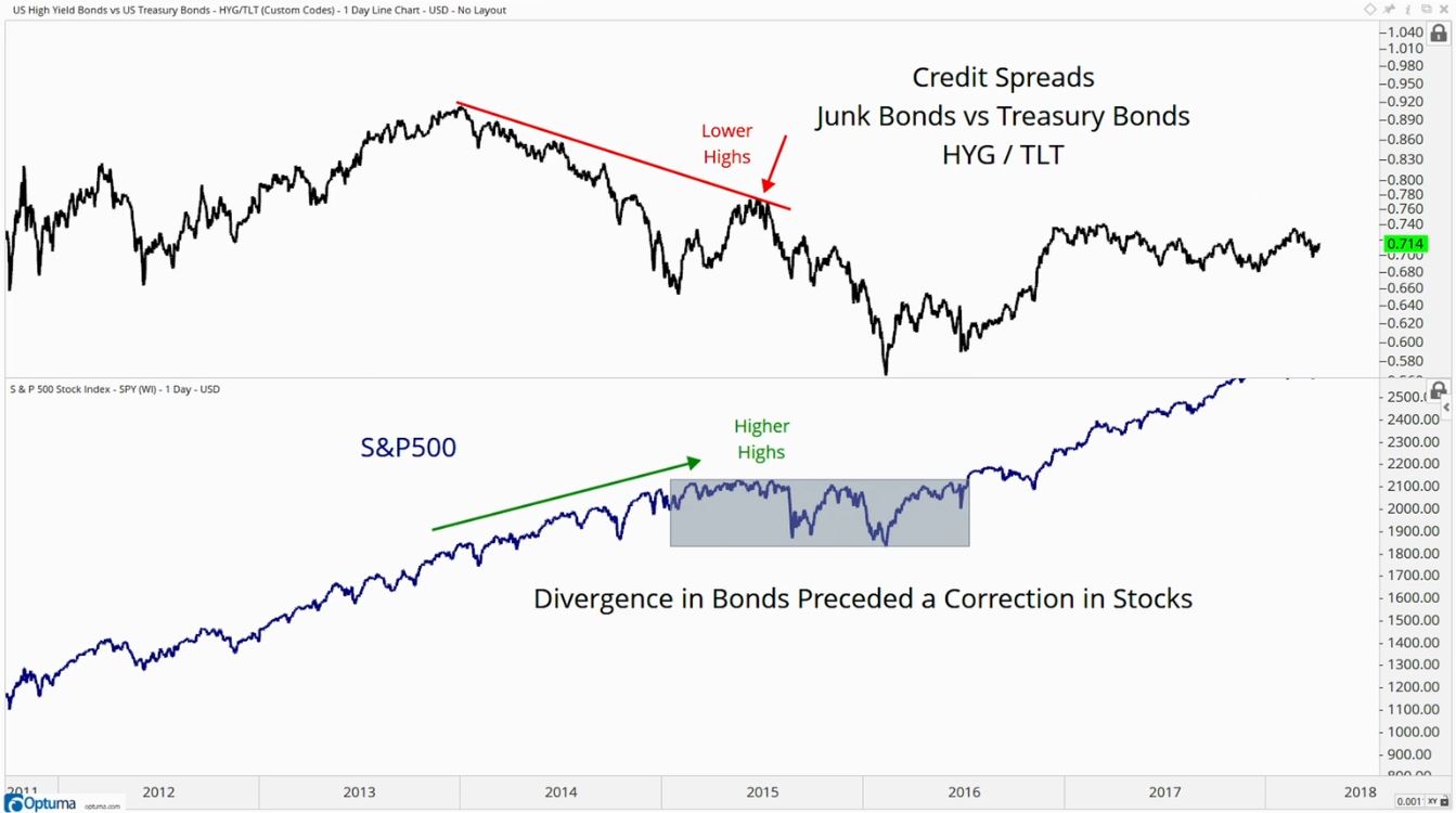
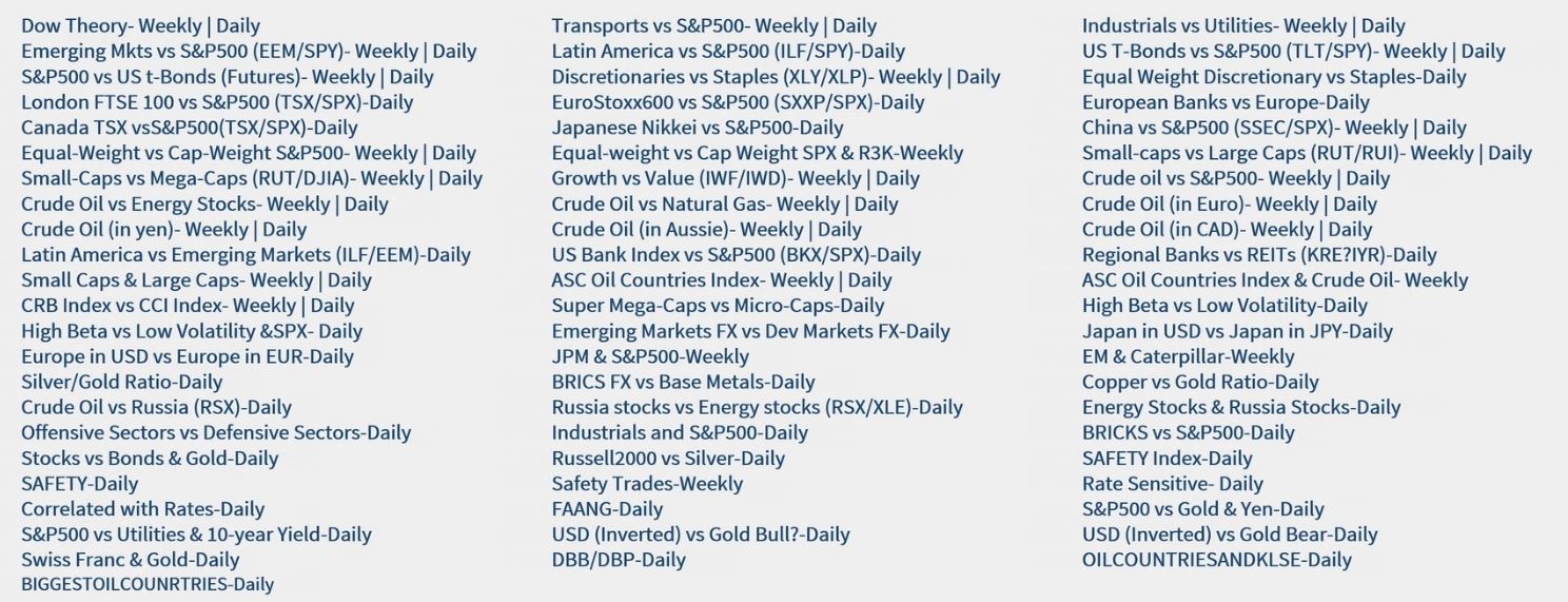
Intermarket analysis is all about looking into other asset classes and seeing how they are performing. There is information in these areas to help make stock market decisions. You must remember that correlations are always changing which means sentiment is constantly shifting. What maybe in favor today may not be in the future.
One of the traditional comparisons is the Stocks (SPY) Vs Bonds (TLT) analysis. This is basically a ratio analysis of one vs the other (Note: Commodities index is the CRB).
The name of the game is to follow what/where institutions go.
US Sector Rotation Models
Sector rotation is the lifeblood of a bull market. Money managers will put there money into underperforming sectors and when those sectors become euphoric they will sell and rotate money elsewhere.
- Sector Rotation
- Find the most important sectors that need to show leadership (ex: financials & technology)
- Identify Offensive Sectors (risk on) vs Defensive Sectors (risk off)
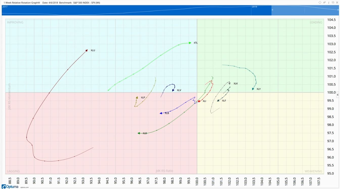
- Use relative rotation graph to find leaders and laggards in the sectors
- SPY look at the weighting of the sectors
- The larger the sector the more importance and strength the sector holds onto the market
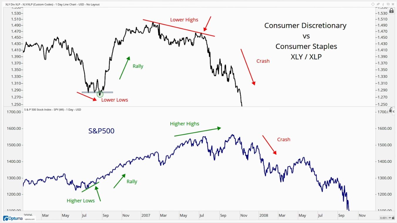
Compare two correlated sectors or asset classes (must be relevant) to find patterns and signals on what is going on with money managers.
Sector rotation graph is a graph that plots all the sectors on a specific timeframe and displays current performance of a sector along with its momentum. Top right are the leading sectors, bottom right are the weakening sectors, bottom left are the lagging sectors, and on top right are the improving sectors. They plot relative strength and momentum. Focus on the outer sectors. Start with the weekly and then go into the daily timeframes to find trading opportunities.
Market Breadth
Breadth of Momentum
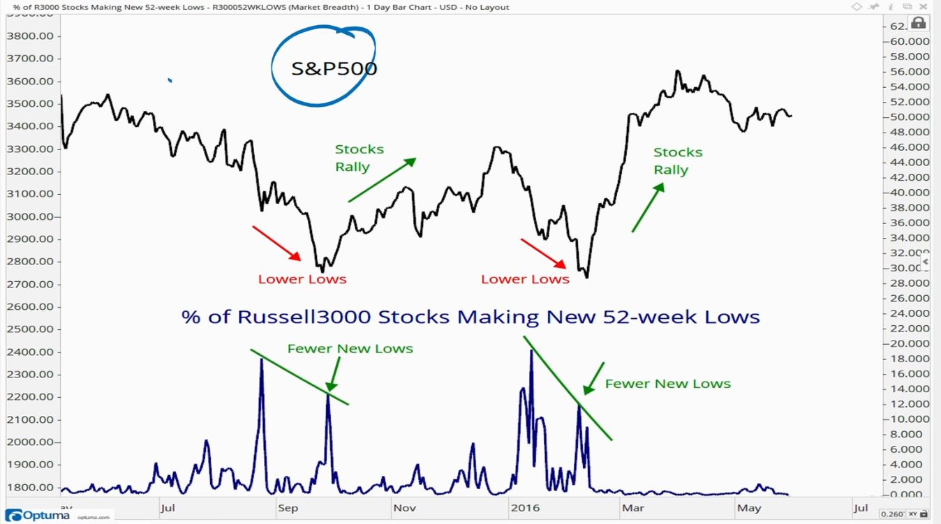
One method to view market breadth of momentum is viewing new 52 week lows of common stocks. If the market (SPY) is making lower lows but the number of common stocks that are making new 52 week lows is less than the previous dips this could be signaling a bottom and reversal.
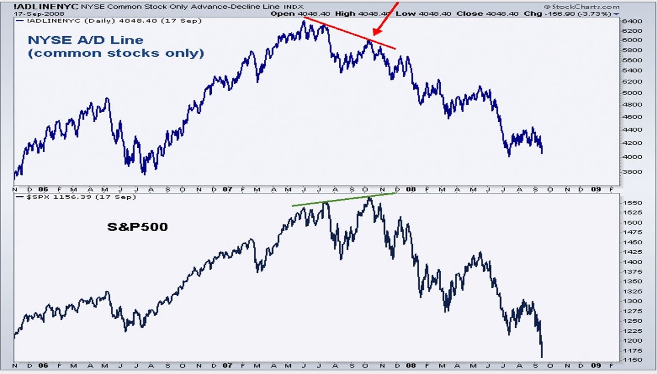
Another alternative is the advanced decline line which is a cumulative tally of the amount of stocks going up minus the number of stocks going down. When market is making new highs we want to see the A/D Line make new highs showing more stocks rising.
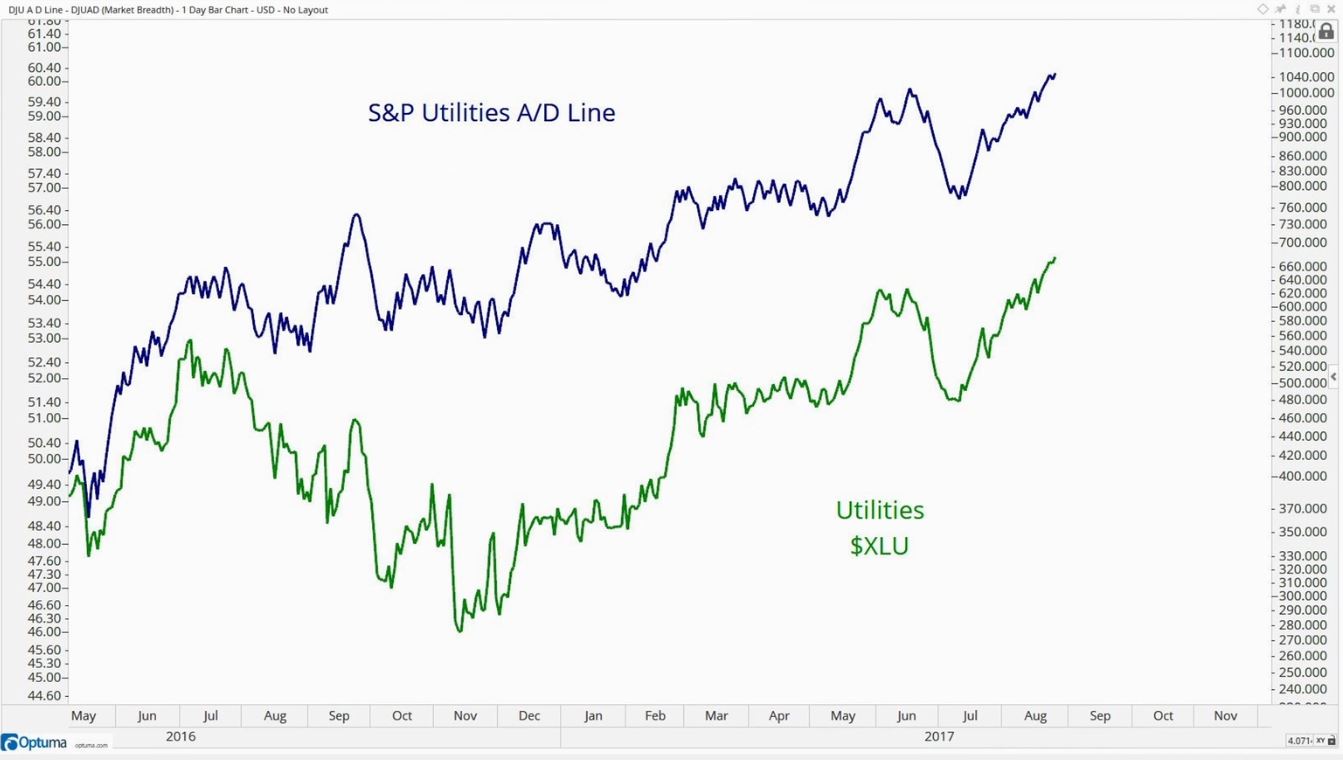
You can also use the A/D Line even for a specific sector to gain confirmation that yes the sector is in an up/down trend.
- Breadth of Momentum
- momentum has ranges ex: 14 days RSI takes a 14 day period.
- more stocks that are making new highs represents an uptrend
- more stocks that are making new lows represents a downtrend
- divergences are signals that sentiment is changing
- non-confirmation is evidence of change.
RSI of a stock in an uptrend will stay above 30 and a stock in downtrend will have RSI below 70.
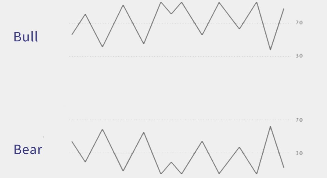
You can use RSI of a basket of stocks in a sector to determine if the sector is in downtrend or uptrend.
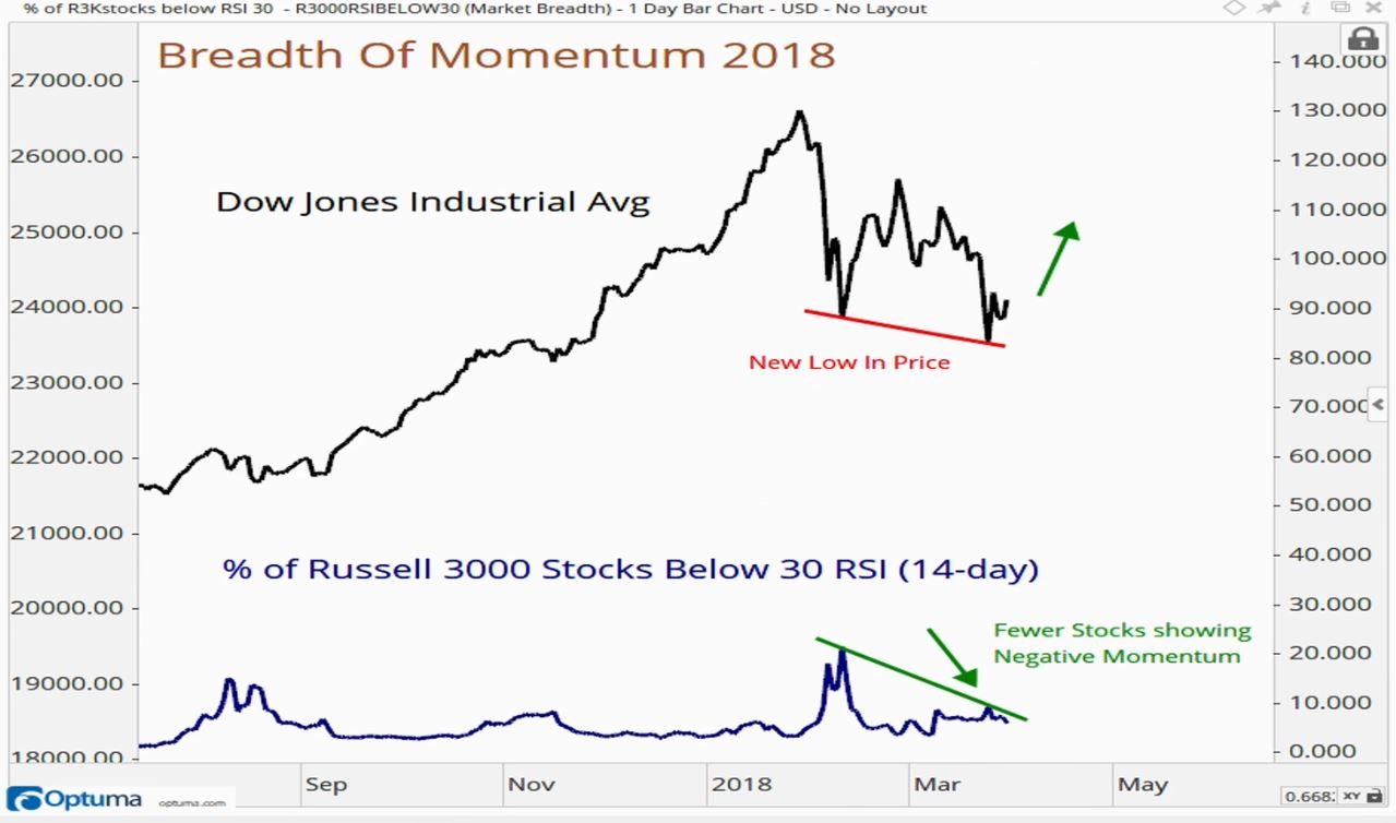
Use the breadth of market for confirmation of a trend and on when to be selling or buying.
Drawdowns & Equal-Weight Indexes
The media will call it a bear market when stocks are down and a bull market when stocks are up but this is not the real definition. We need to see drawdowns in the stocks as a whole and a stealth bear market. By stealth we mean that the indexes may not fall 20+% but majority of stocks in that sector/index do start to fall by that much. Its not only about the indexes but what is happening to the components of the indexes. As the market was grinding higher in 2017 majority of the gains were caused by just a handful of stocks; FAANG (Facebook, Amazon, Apple, Netflix, Google).
Most indexes are market cap weighted indexes which means that the larger the company the more weight (effect) it has in the index. To get rid of the imbalance we want an equal-weighted index.
- Equal-Weight Index
- gives information about the entire universe of stocks in that sector or index
- useful in a sum-of-the-parts analysis
A great example of this is if you look at the S&P Consumer Discretionary Sector ETF Weighting Amazon is roughly 35% of the entire ETF. If there is a huge up or down swing in price of Amazon it will effect the index sharply vs say a Lowes which is only 4%. See below how different an equally weighted index is vs cap weighted.
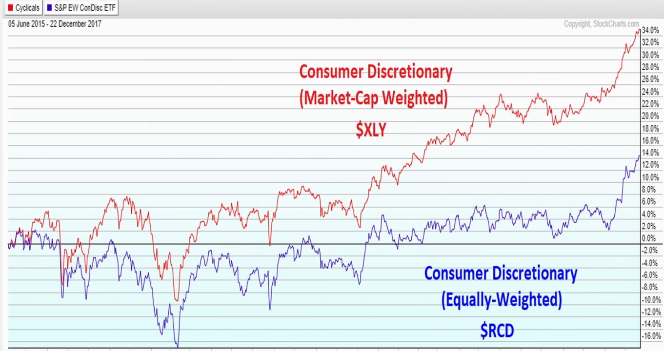
Equally weighted indexes are not correlated to cap weighted index such that when market it going up it doesn’t necessarily mean the equally weighted index will also go up. You must utilize RSI, moving averages, pattern recognitions, and even fibonacci levels. A few large caps in a cap index could move the entire index but in reality entire sector has not really changed but in fact could have dropped.
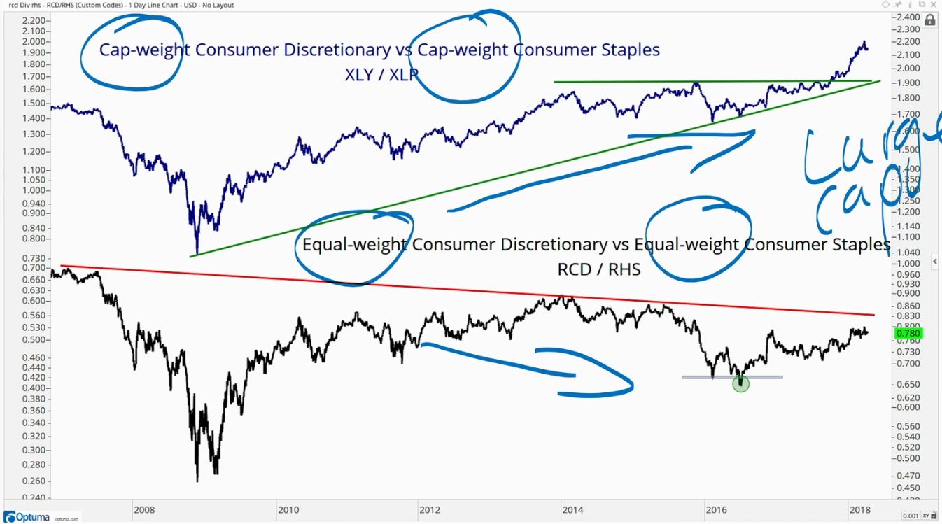
Look at the group of stocks collectively, evaluate the breadth of momentum, and then identify the stocks and see which ones are performing and truly breaking out.
Advanced Application
Advanced Momentum
There are a lot of different ways to track momentum such as MACD, ADX, CCI… but the most widely used and simplest is the RSI (relative strength index). Use the RSI oscillator to determine if asset is bullish or bearish.
In an uptrend when prices make new highs momentum will get to 70+ which becomes overbought. During the corrections of uptrends RSI will fall but will hold above 30+ and strong trends will hold above 50+. Strong stocks get overbought and if the RSI of a strong assets starts to fall and becomes oversold that leads into distribution.
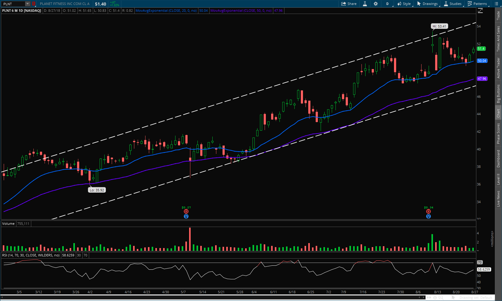
In a downtrend prices make new lows momentum will fall below 30 which becomes oversold. During the rallies in a downtrend you will not see 70+ and strong downtrends you will see RSI less than 50.
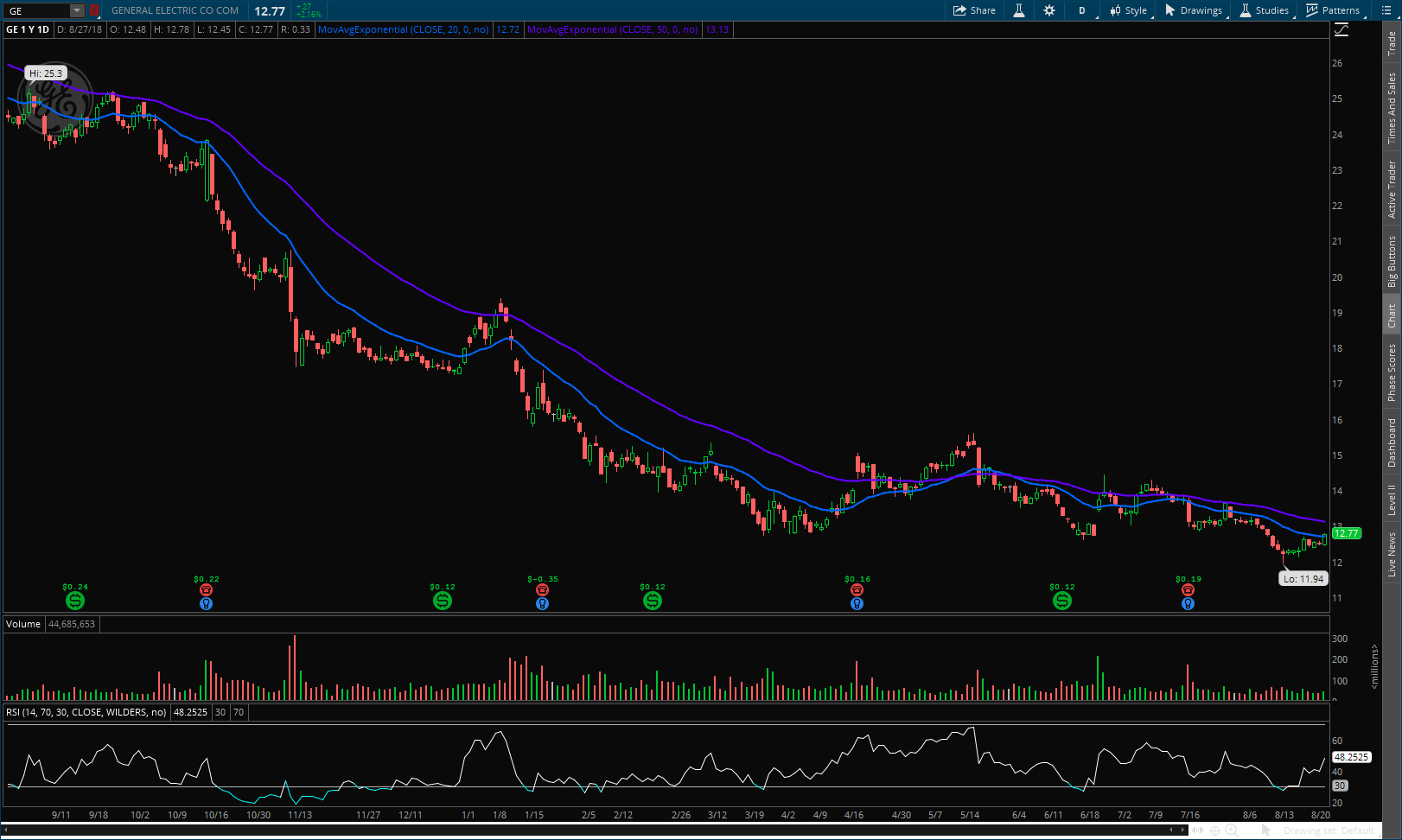
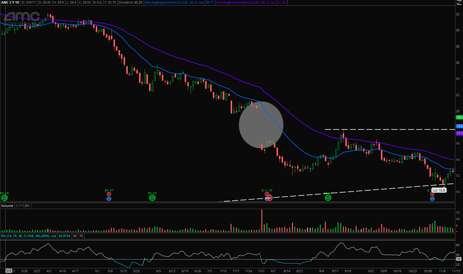
Besides using RSI for overbought and oversold readings you can use RSI to find bullish and bearish divergences. So if you are seeing lower lows in stock price but seeing lower highs on the RSI that is a bullish divergence showing that the trend is maybe likely to change in the short term. This does not always get confirmed see GE and AMC. If you see a bullish divergence that isn’t turning that means its going a lot lower.
Advanced Candlestick
We need to make sure that each candle’s timeframe is equal. When you start using intraday charts such as hourly charts, this becomes a problem because the market is open from 9:30AM ET to 4PM ET totaling 6.5 hours. To solve this problem either switch to 30 minute candle or a 65 minute candle.
Dojis - are found at the ends of moves like tops and bottoms. These candles represent indecision and the market is trying to figure itself out.
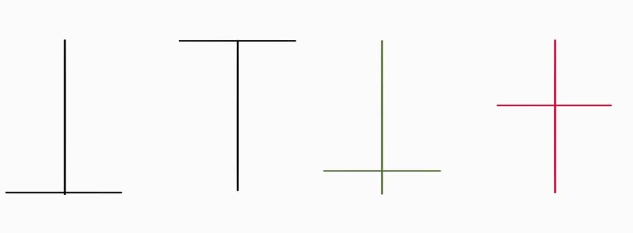
- Doji 1 - BEARISH - opens at the bottom rallies but then fades all the way back to opening price
- Doji 2 - BULLISH - when you see this at the end of a downtrend. Opens at the top sold off but then rallied back to opening
- Doji 3 - Opened but closed above opening price
- Doji 4 - Opened but closed below opening price
Its where the location of the doji is during the trend that matters.
Engulfing Pattern - the two types are bullish and bearish engulfing patterns. What happens is that the lows and highs of the big candle are lower and higher than previous days candle and also real body of the candle overshadows the previous day(s) candles.

Hammer - these come during a downtrend which needs few days of nonstop red candles making new lows. The hammer consists of an open near where then price begins to fall and then rallies back near the top but either over it or beneath is forming a “hammer”. The confirmation comes the following days where you want to see green candles otherwise it is most likely going lower for other fundamental reasons. The more hammers next to each other the more powerful the effect
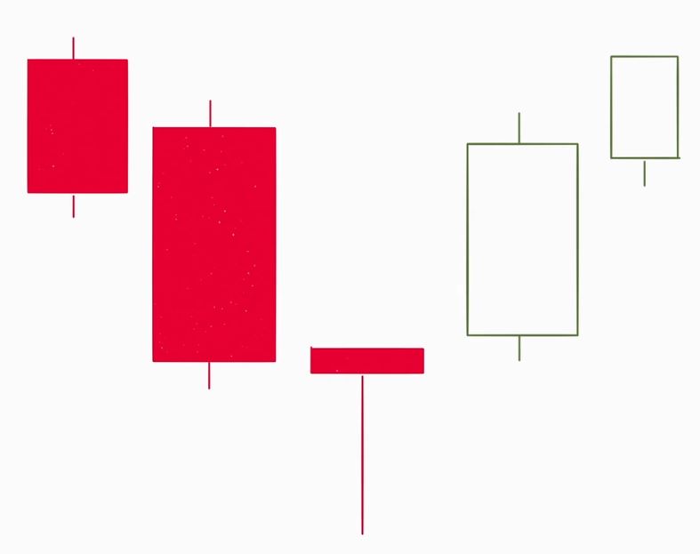
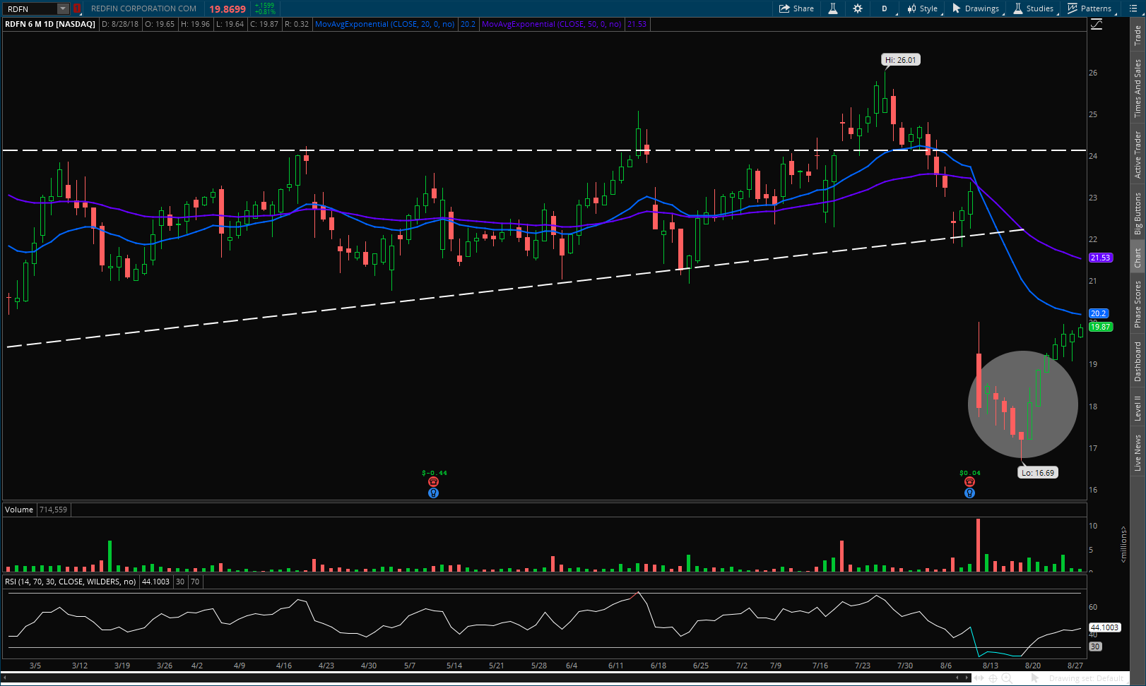
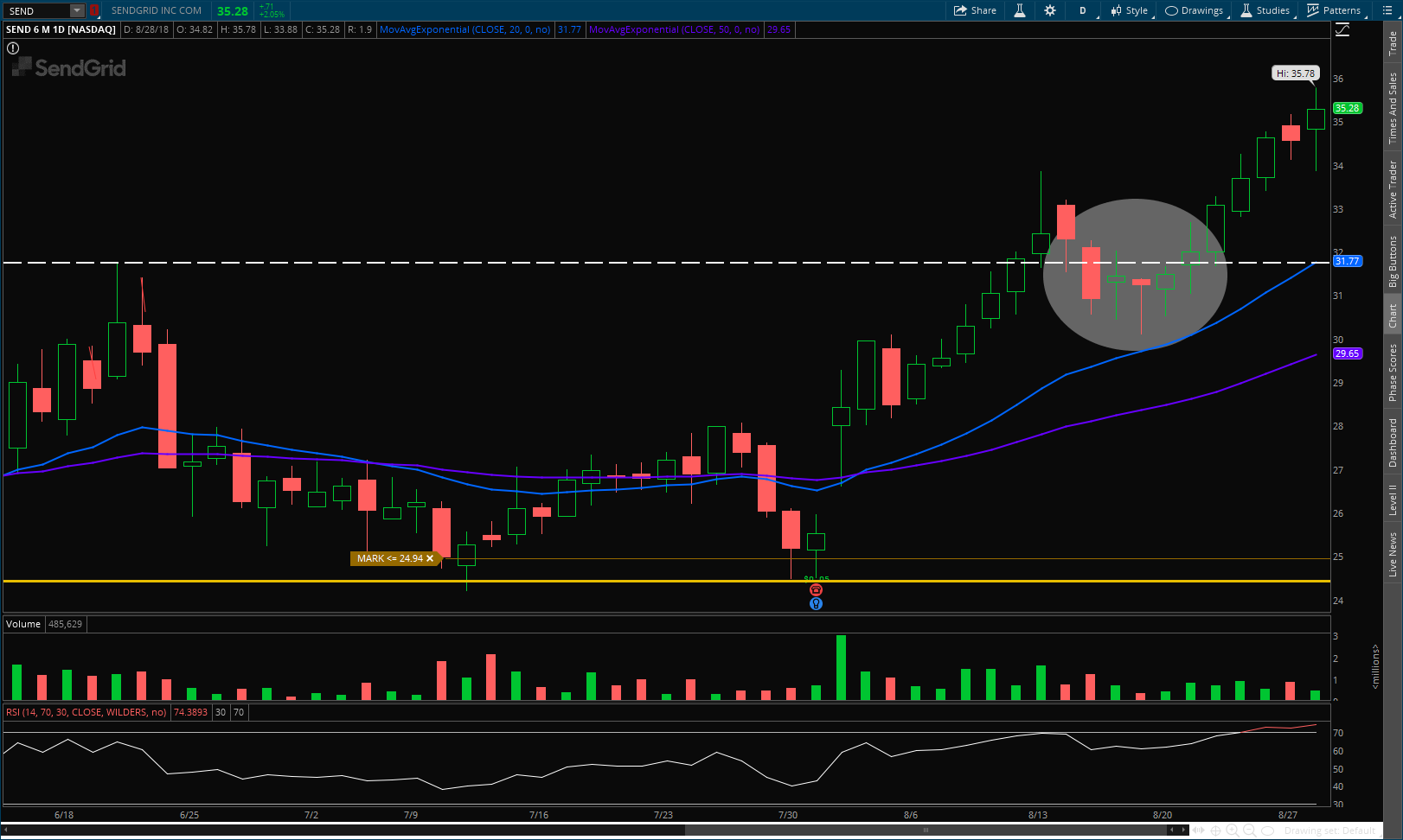
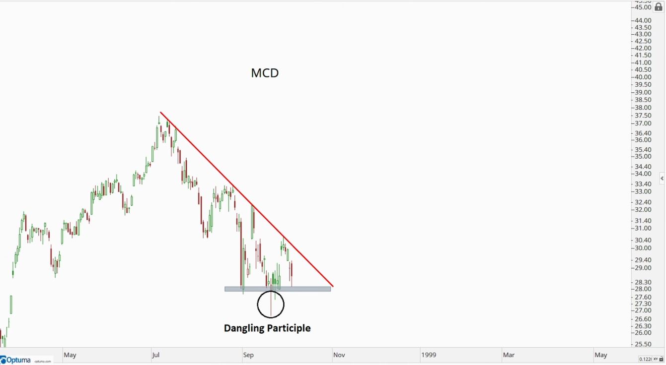
Sometimes you will see an outlier candle that just doesn’t seem to fit with the rest of the candles, usually near support or resistance, followed by an immediate reversal the next day continuing the pattern it was on. When you see this start buying the stock and have your stop-loss under support zone because that candle signals a failure of stock trying to continue trend and will most likely reverse. Combine with RSI also for more confirmation
Gaps
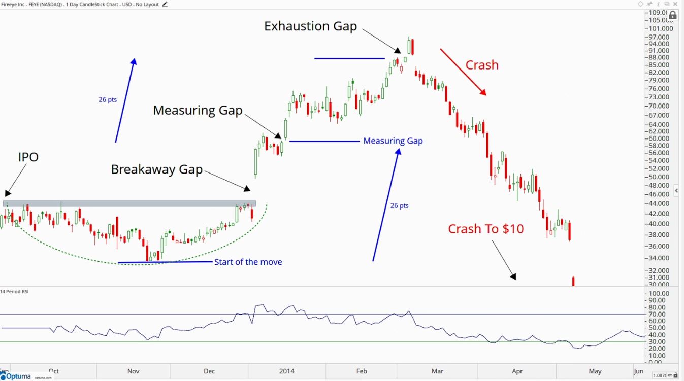
There are three different types of GAPS:
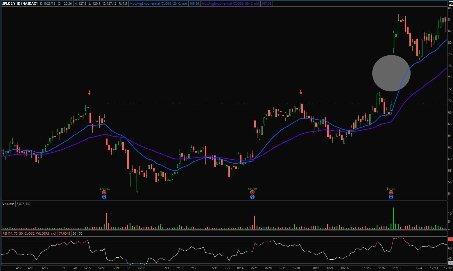
- Breakaways - these are when stocks have been in a range and then gap and breakout of the range to begin new trend. They usually do not get filled
- Measuring - these gaps come in the middle of the moves within an on going trend. It is continuation of trend.
- Exhaustion - these gaps are the last push before the buying or selling becomes exhausted and reverses. Gets filled really quickly and then trend reverses. People chasing stock.
Where the gaps occurs is the most important. Also note that some gaps occur daily like with and ADR stock where the action takes place overnight; be aware.
VWAP
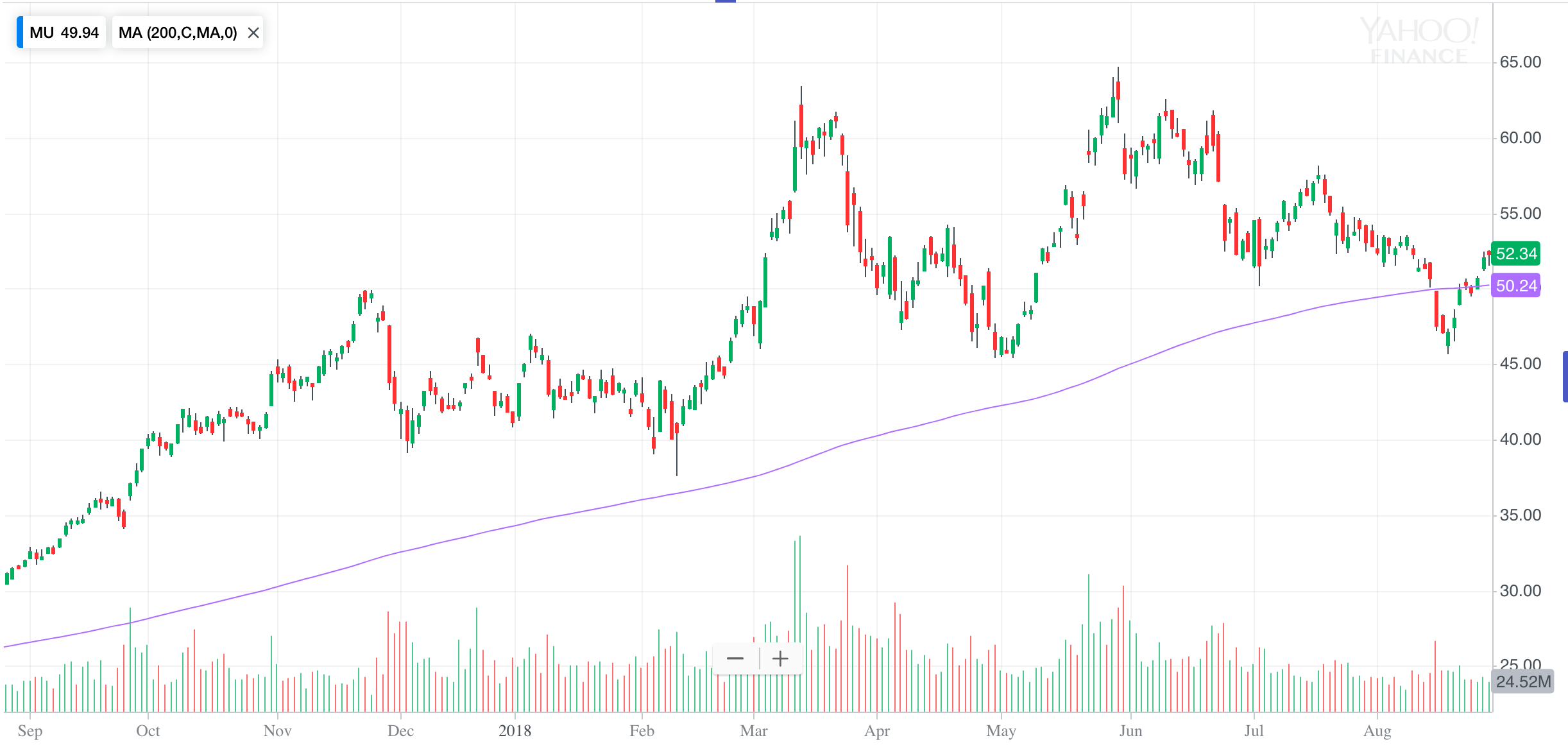
A simple moving average is used to help identify the direction of the primary trend. Price is the most important technical indicator. Everything else is a supplemental indicator. Moving averages are not support and resistance areas.
When a primary trend is upwards and there is a break of the 200DMA the media will talk about bear territory or something but use it was a buying opportunity. The moving average is an invisible line.
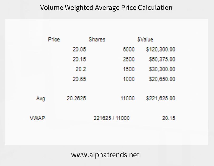
Volume Weighted Average Price (VWAP) is the perfect combination of price, volume, and time. It is not an average because there is volume involved which represents actual institutional money flow. The trading firms have to buy the best price possible. VWAP also does act as support and resistance since institutions are buying and selling against it.
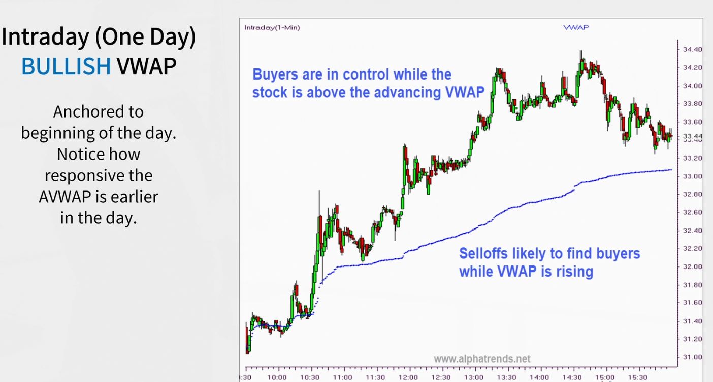
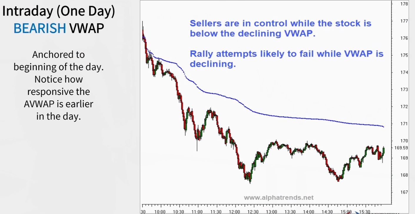
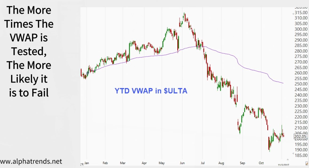
Anchored VWAP is a VWAP that starts from a key date or swing level ex: gaps, intraday, year to date, IPO date. In addition to institutions algorithmic traders use VWAP as a basis in their analysis. VWAP is also more responsive to volume than price. Also just like a support and resistance line the more time a VWAP is tested the more likely it will break.
Custom Indexes
Supplements & Weight of Evidence
There have been many indexes created S&P500, XLF for Financials, XLK for Technology etc… Think about it, if you’re staring at the same indexes as everyone else, what edge do you have?
When creating a custom index think about what asset classes should it be composed of ex: commodities, stocks, metals, countries, continents, currencies etc… Or think of defensive assets like gold/bonds/yen.
New ETFs or Futures are created everyday but they don’t have data that can be recreated through a custom index.
Technical Analysis & Trading
Technical Signals to Trading Signals
Scans come LAST, not first. Take what the market gives you first by taking a top down approach. After that then you dive down and find out what types of stocks you’re looking for.
We want to be buying winners, stocks making new 52 week highs, positive momentum (RSI). Avoid underperforms and in times when stocks are falling you need to do top down analysis and find out where the money is going.
For the entry targets you want to be buying closer to the risk level so that the risk vs reward ratio is greater. The tighter the risk/stop loss, the higher likelihood for a whipsaw. We need to find a balance where you keep risk minimal but allow the market wiggle room. Remember to wait for the right pitch.
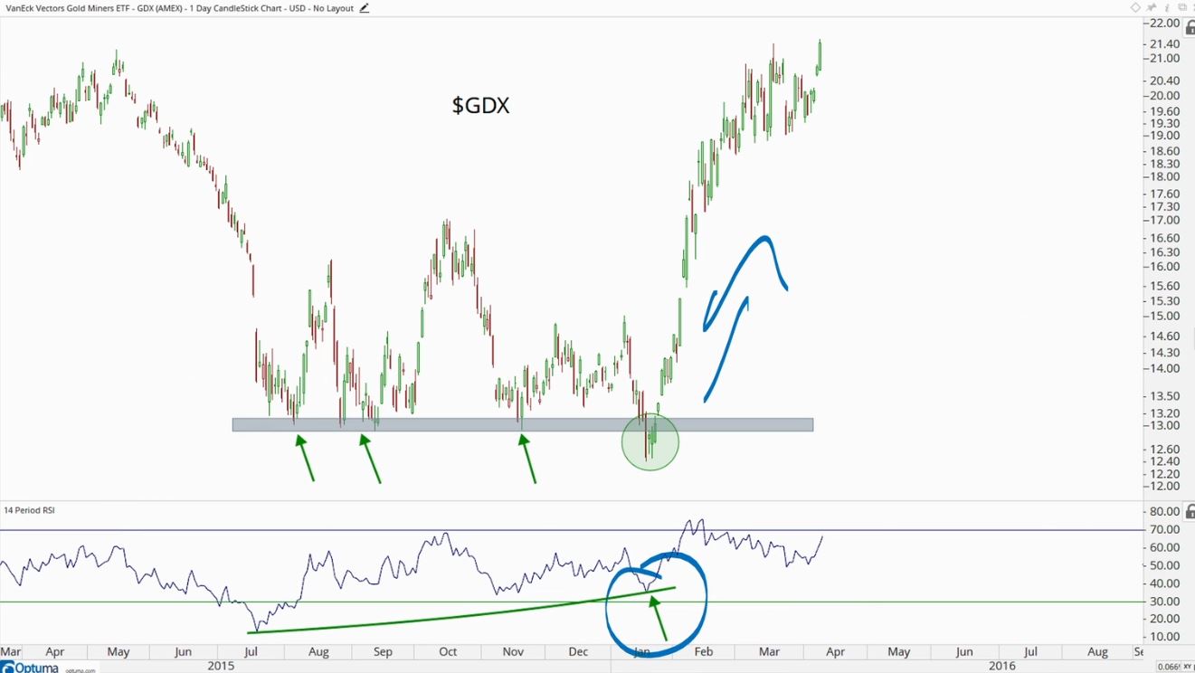
Re-Entry & Whipsaws
The market does not care what you think it should do. Find a balance between price risk and whipsaw risk. Re-enter appropriately.
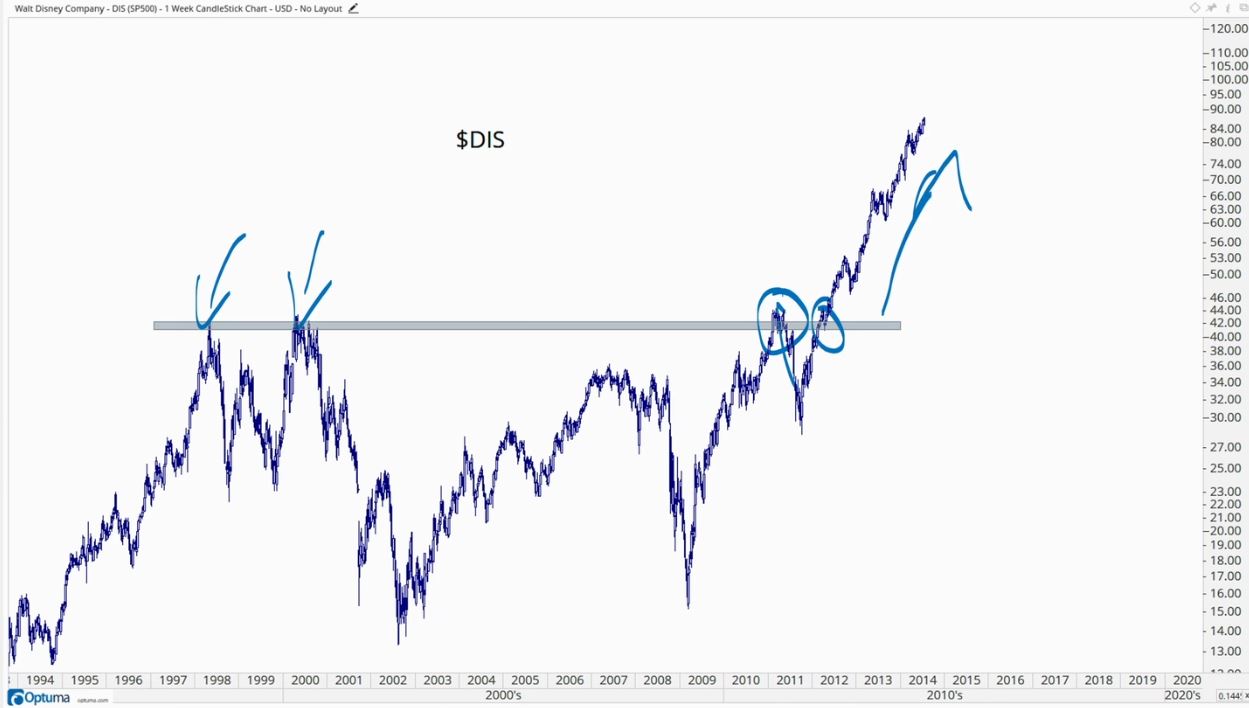
From failed moves come fast moves in the opposite direction. It is a rubber band effect. Take advantage when positioning is skewed in favor of one side because that will creates and explosive unwind.